

Portfolio typography should prioritize readability and clear hierarchy above every decorative impulse. Limit your type system to one or two font families, meet WCAG contrast minimums, and set body text at 16 to 18 pixels before touching anything else. Responsive scaling and font loading performance matter next. The checklist below covers implementation.
TL;DR:
- Using a maximum of two font families with clear size and weight distinctions ensures a clean hierarchy and readable portfolio content.
- Body text should be at least 16 pixels, with 18 pixels preferred for long case studies to reduce reading fatigue during review.
- Contrast ratios must meet 4.5:1 for normal text and 3:1 for large text to pass accessibility standards and improve readability.
- Responsive font sizing with CSS clamp and appropriate touch target sizes enhance mobile readability without visual jumps.
- Fixing low-contrast, pale grey body text is an easy, high-impact adjustment that greatly improves overall legibility.
Table of Contents
- What Is Portfolio Typography and Why Does It Matter to Recruiters?
- How Big Should Portfolio Text Be?
- What Contrast Ratio Do Recruiter-Facing Portfolios Need?
- Should Portfolio Typography Resize Across Devices?
- When Should You Use Monospace in a Portfolio?
- How Do You Audit Your Portfolio’s Typography Fast?
- Alloquy Perspective: Why Readable Typography Protects Verified Evidence
- Put These Typography Rules to Work with Alloquy
- Sources
- FAQ
What Is Portfolio Typography and Why Does It Matter to Recruiters?
Portfolio typography is the system of font choices, sizing, and spacing that governs how a recruiter reads your case studies, project descriptions, and verified achievements online. It is distinct from typeface design or experimental type art. The goal here is functional: make dense professional content scannable in the 30 to 90 seconds a recruiter typically spends on a first pass.
A type system has three roles, and conflating them is where most portfolios go wrong. Body text carries sustained reading. Display type handles headings and short bursts of emphasis. An optional monospace face isolates code snippets or metadata. Each role needs a distinct visual signal, but that signal should come from size, weight, and spacing, not from stacking five different fonts.
Two families is the pragmatic standard for a professional portfolio, and role separation between a readable body face and a personality-driven display face is what makes long case studies bearable while still letting headlines carry brand voice. Three pairing strategies cover almost every situation:
- Same family, different weights. A single variable font like Inter or Source Sans, using Regular for body and Semibold or Bold for headings. Lowest risk, highest consistency.
- Serif plus sans. A serif for headings signals editorial credibility, paired with a sans body font for clean reading. Works well for writers, strategists, and content-heavy portfolios.
- Display plus neutral body. A distinctive display face for headlines paired with a workhorse sans like system-ui or Inter for body copy. Common in design and product portfolios that want personality without sacrificing legibility.
Tech and product roles tend to read as more credible with a geometric sans across the board. Editorial and content roles benefit from a serif accent. Approachable, generalist portfolios do fine with the same-family approach, since it never distracts from the substance of the work.
How Big Should Portfolio Text Be?
Sixteen pixels is the floor for body text; go smaller and you are asking recruiters to squint through your best work. Eighteen pixels is the recommended size for long-form case studies, since it measurably reduces reading fatigue during extended review. Captions can drop to around 14 pixels, but nothing in your primary reading flow should sit below 16.
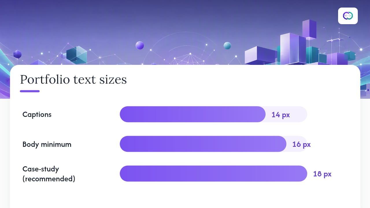
A type scale keeps your heading sizes from feeling arbitrary. Pick a ratio between 1.20 and 1.333 and multiply up from your base size. At an 18px base with a 1.25 ratio, you get roughly 18px body, 22.5px for H3, 28px for H2, and 35px for H1. That consistency is what makes a portfolio feel engineered rather than improvised.
Spacing rules matter just as much as size:
- Body line-height: 1.5 to 1.7, which gives dense case study text room to breathe without feeling loose.
- Heading line-height: 1.1 to 1.3, tighter because headlines are short and don’t need the same visual air.
- Paragraph spacing: at least one full line-height between paragraphs, so sections don’t blur into each other on scroll.
- Measure: keep lines between 45 and 75 characters, or simply set
max-width: 65chon your text containers.
Pro Tip: Paste a full paragraph of your actual case study copy into your layout before finalizing sizes. Lorem ipsum never reveals how your real sentence lengths wrap, and that’s exactly where measure problems show up.
What Contrast Ratio Do Recruiter-Facing Portfolios Need?
WCAG 2.1 AA requires a minimum contrast ratio of 4.5:1 for normal text and 3:1 for large text, where “large” means 18px and above, or 14px and above when bold. Miss these thresholds and your portfolio fails an objective accessibility standard, not just a subjective taste test.
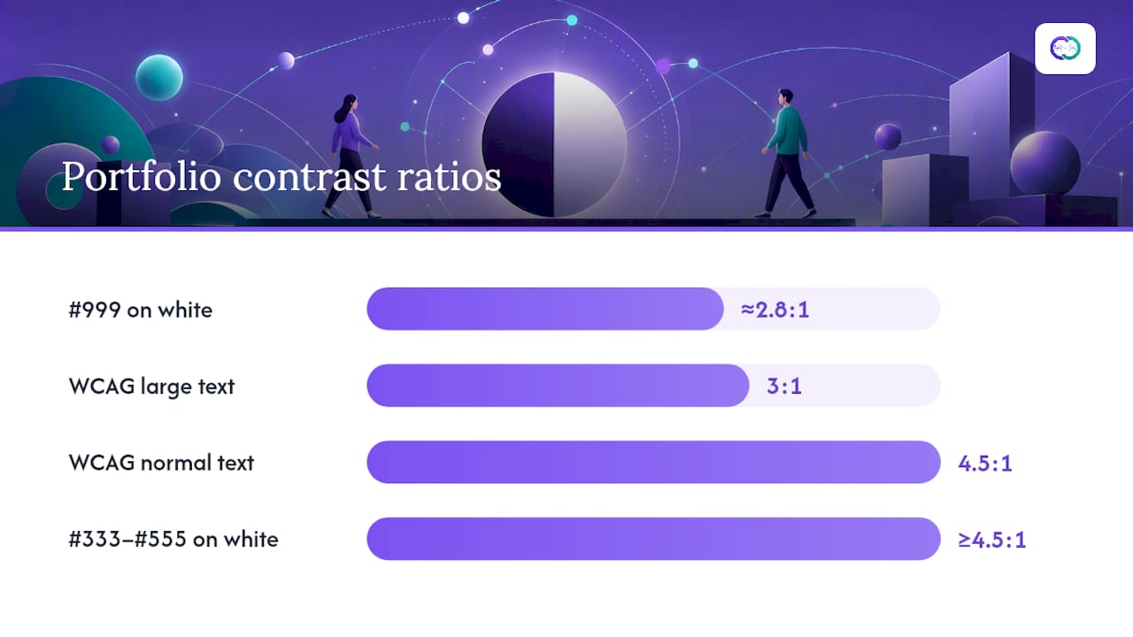
Light grey body text on white is the single most common typography mistake on portfolio sites, and it is also one of the highest-impact, lowest-effort fixes available. A pale grey like #999 on white often lands around 2.8:1, well under the AA minimum. Swap it for something in the #333 to #555 range and you clear 4.5:1 comfortably while keeping the softer, non-black feel many portfolios want for body copy.
Quick QA steps before you publish:
- Run every body text and background pairing through the WebAIM Contrast Checker.
- Check large headings separately since they only need to hit 3:1, which gives you more color flexibility there.
- Test your color palette against both light and dark mode if your site supports it.
- Zoom your browser to 200% and confirm nothing clips or overlaps, since accessibility reviewers routinely test at that zoom level.
Following web accessibility best practices also tends to improve how search engines and AI crawlers parse your page content, which matters if you want your portfolio discoverable beyond direct recruiter links.
Should Portfolio Typography Resize Across Devices?
Yes, and CSS clamp() is the practical way to do it. Fluid typography scales smoothly between screen sizes instead of snapping abruptly at fixed breakpoints, which keeps your hierarchy consistent whether someone is on a phone or a monitor. A heading might use font-size: clamp(1.75rem, 4vw + 1rem, 3rem), staying readable at both extremes without a jarring jump at any single width.
Touch targets need their own minimum. Any tappable text link, button, or navigation element should measure at least 44 by 44 points on iOS or 48 by 48 density-independent pixels on Android. A recruiter tapping through your case studies on a phone should never have to zoom in just to hit the right link.
Font loading affects how reliable your site feels before a single word of hierarchy matters. Three habits fix most performance problems:
- Set
font-display: swapso text renders in a fallback font immediately instead of staying invisible while the custom font loads. - Load only the weights you actually use. Requesting seven weights when you use two triples your font payload for nothing.
- Consider a variable font to cover multiple weights in one file, and always include a system font fallback stack.
Pro Tip: Test your portfolio on a throttled 4G connection, not just your office Wi-Fi. Font loading delays that are invisible on fiber become obvious flashes of unstyled text on a recruiter’s phone during a commute.
When Should You Use Monospace in a Portfolio?
Monospace fonts belong in exactly two places: code snippets and structured metadata like dates, file names, or technical specs. Using monospace anywhere else, including body paragraphs or headings, undercuts the clean hierarchy you built everywhere else. Keep it at 14 to 16px, matching regular weight for readability rather than bold, which tends to look cramped in fixed-width faces.
Captions deserve their own consistent treatment. Fourteen-pixel captions placed directly below an image with an 8 to 12 pixel gap, set in a slightly lighter but still WCAG-compliant color, give context without competing with the image itself. A caption should explain why the image matters to the case study, not just describe what’s visible in it.
Metadata labels, like project dates or role titles, need consistent alignment and spacing across every project page. If one case study left-aligns its date and the next centers it, the inconsistency reads as sloppiness even when the underlying work is strong.
How Do You Audit Your Portfolio’s Typography Fast?
A clean rollout follows a fixed sequence rather than random tweaking:
- Set a root font-size (commonly 100%, or 16px, as your base unit).
- Build a type scale using a single ratio between 1.20 and 1.333, applied consistently to every heading level.
- Enforce
max-width: 65chon body text containers to control measure. - Set line-heights: 1.5 to 1.7 for body, 1.1 to 1.3 for headings.
- Run every color pairing through a contrast checker and fix anything under 4.5:1.
- Test on at least three real device sizes, not just browser dev tools.
Copy-ready CSS to start from:
body { font-family: system-ui, -apple-system, "Segoe UI", sans-serif; }
h1 { font-size: clamp(1.75rem, 4vw + 1rem, 3rem); line-height: 1.2; }
p { max-width: 65ch; line-height: 1.6; }
Pro Tip: Print your case study page to PDF and read it there. Screen habits let small contrast and spacing issues slide; a printed page exposes them instantly. Once your base system holds up, apply the same sizing rules across every project so your case study structure stays consistent site-wide.
Alloquy Perspective: Why Readable Typography Protects Verified Evidence
Alloquy links a professional’s Google Drive documents to a custom AI assistant, letting recruiters ask direct questions about verified work. That model only pays off if the surrounding page is legible enough for a recruiter to trust what they’re reading before they even open the chat. Cluttered type erodes credibility fast. Clean hierarchy, adequate contrast, and consistent sizing reduce the friction between a recruiter’s question and the evidence-backed answer Alloquy’s AI provides, which is exactly the kind of clarity a verification-first portfolio depends on.
— Alloquy Team
Put These Typography Rules to Work with Alloquy
Good typography earns a recruiter’s attention. Alloquy gives that attention something substantive to land on. Once your fonts, sizes, and contrast are dialed in, Alloquy layers an AI assistant on top of your verified work, letting recruiters ask direct questions about your projects and get evidence-backed answers pulled straight from your linked Google Drive documents.
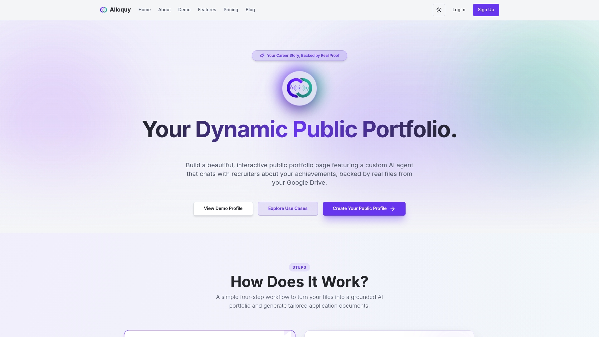
The platform includes customizable branding so your typography choices carry through to your public profile, plus tools to generate tailored resumes and cover letters from verified data. If you’ve already tightened your type scale and contrast using the rules above, see how those choices look inside a live profile by checking Alloquy’s feature set. Ready to move past a static resume entirely? Compare pricing plans and set up your first verified, AI-powered portfolio today.
Sources
- 4 typography tweaks to make your UX portfolio instantly look better | Medium
- Website typography guide | Evoke Studio
- Typography for portfolios | The Crit
- How to design a web typography system for readability and brand | 137Foundry
FAQ
How Many Fonts Should a Portfolio Use?
Stick to one or two font families, with a third monospace face allowed only for code or metadata. Three fonts is the practical maximum for a professional, recruiter-facing portfolio.
What Font Size Is Best for Portfolio Body Text?
Sixteen pixels is the minimum for body text, and 18 pixels is recommended for long-form case studies since it reduces reading fatigue during recruiter review.
What Contrast Ratio Does My Portfolio Need to Pass Accessibility Checks?
WCAG 2.1 AA requires at least 4.5:1 contrast for normal text and 3:1 for large text (18px and up, or 14px and up when bold).
Does Alloquy Handle Typography for Me?
Customizable branding options let you carry consistent, accessible typography across your public profile while an AI assistant handles recruiter Q&A on verified work.
What’s the Easiest Typography Fix to Make Right Now?
Fix low-contrast grey body text first. Swapping a pale grey for a hex value in the #333 to #555 range is a five-minute change with an immediate readability payoff.