

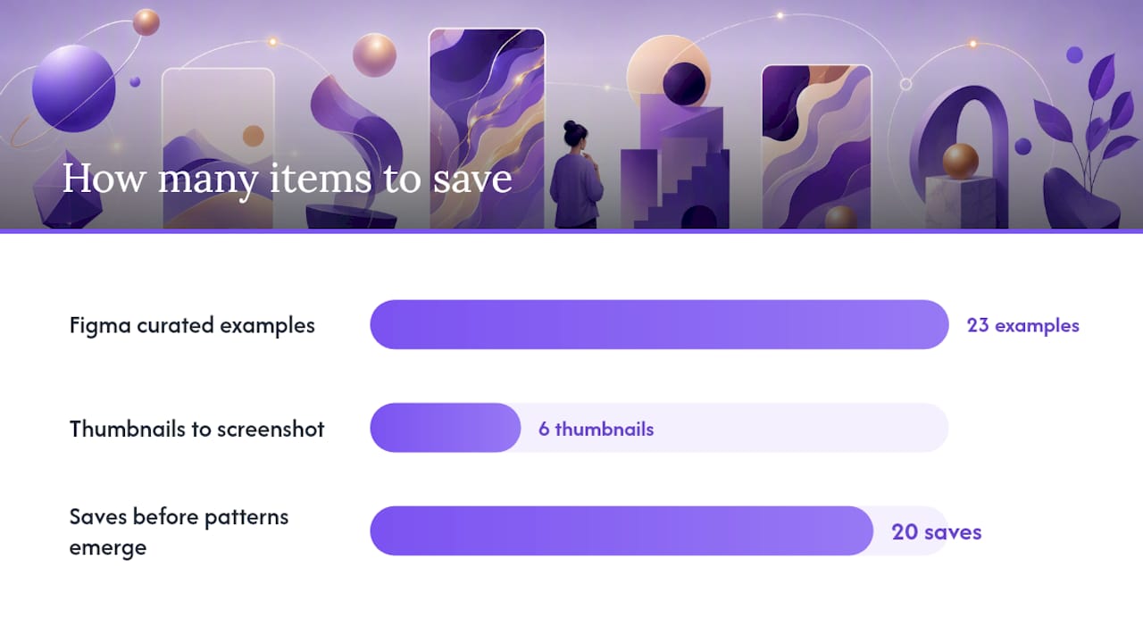
Start with three galleries, one layout decision, and one project to refresh. Wall of Portfolios, Dribbble, Awwwards, Bestfolios, One Page Love, Siteinspire, and Figma’s resource library collectively index thousands of portfolio sites, filterable by role, style, and interaction pattern. The most efficient first move: spend 20 minutes collecting six thumbnails that stop your scroll, identify the one layout pattern they share, then mark a single project in your existing portfolio to rebuild around that pattern this week.
First checks before you copy any example:
- Does it render cleanly on a phone screen without horizontal scroll?
- Does the role signal appear in the first viewport, above the fold?
- Does at least one project card show a measurable outcome, not just a visual?
Pro Tip: Screenshot the mobile view of every portfolio you admire, not just the desktop. Recruiters frequently open portfolio links on their phones, and a layout that collapses to a single column with thumb-friendly tap targets tells you far more about the designer’s craft than the full-bleed desktop hero does.
Table of Contents
- Where to find the best portfolio design inspiration by gallery type
- 10 portfolio layout styles worth copying right now
- What every project case study must include
- Why storytelling and mobile-first design produce better recruiter outcomes
- How to adapt your portfolio emphasis by role and audience
- A practical 5-step plan to update your portfolio this week
- Key Takeaways
- What’s actually working in portfolio design right now
- Alloquy turns portfolio inspiration into verified, interactive proof
- Useful sources and galleries to explore
Where to find the best portfolio design inspiration by gallery type
Each gallery rewards a different browsing strategy. Figma’s resource library pairs 23 curated examples with editorial notes on curation logic and measurable-impact writing, making it the most instructive starting point for designers who want to understand why a portfolio works, not just what it looks like. Capture the project description structure, not just the visual.
Awwwards surfaces high-craft, award-winning work. The risk is that award galleries tend to reward spectacle over scan clarity. Steal the structural decisions (grid density, typographic hierarchy, scroll pacing) and leave the WebGL waterfalls behind unless your role demands them.
Dribbble and Bestfolios are role-filterable, which makes them efficient for comparative browsing. Filter by “UX” or “product design” and screenshot the first six thumbnails that communicate role and outcome simultaneously. One Page Love and Siteinspire skew toward minimal, typography-led single-page designs, useful for designers who want to study restraint.
Three ways to mine any gallery productively:
- Filter by your exact role before browsing; generic browsing produces generic inspiration.
- Save mobile screenshots alongside desktop ones and note which layouts survive the compression.
- For each saved example, record three metadata points: layout type, platform used, and whether a measurable outcome appears on the project card.
Pro Tip: Build a private Figma board or Notion database with your saved screenshots. Tag each one with layout type (grid, scroll, one-page) and role signal strength (clear, ambiguous, absent). After 20 saves, patterns emerge that are far more useful than any single example.
10 portfolio layout styles worth copying right now
Layout archetypes give designers a decision framework: match the pattern to your project count, role, and hiring goal rather than choosing by aesthetic preference alone.
1. Proof-first grid
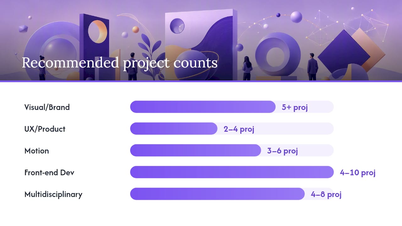
A symmetrical or asymmetrical grid where every card leads with a project thumbnail, one-line outcome, and role label. Best for visual designers and brand designers with five or more projects. The homepage reads as a curated gallery, and recruiters can scan role fit in under ten seconds.
2. Featured lead with supporting grid
One hero project occupies the top half of the page; a smaller grid fills below. Effective when one project is significantly stronger than the rest. The hero controls the first impression; the grid proves range.
3. Story scroll
A single-column, long-scroll layout that narrates one or two projects in depth. Best for UX and product designers with fewer projects but rich process documentation. The scroll itself becomes the case study.
4. Business-card one-screen
Name, title, one-line value proposition, and a single CTA occupy the entire first viewport. No project thumbnails above the fold. Works for senior practitioners whose reputation precedes them, or for designers who send the portfolio link alongside a targeted proposal.
5. Magazine or hero-led
Full-bleed imagery, editorial typography, and a strong visual hierarchy borrowed from editorial design. Best for art directors, editorial designers, and motion designers. Requires high-quality photography or motion assets to avoid feeling empty.
6. Case-study-first
The homepage lists project titles with one-sentence outcome summaries rather than thumbnails. Clicking a title opens a full case study. This pattern signals process-oriented thinking and works well for product designers targeting product teams.
7. Sidebar navigation
A fixed left-column nav lists project names; the right panel displays the selected project. Efficient for developers and multidisciplinary designers with many projects who want to give recruiters direct access without scrolling.
8. Minimal signpost
Sparse typography, generous whitespace, and a short list of links. No thumbnails, no case studies on the homepage. Functions as a professional directory pointing to external work (GitHub, Behance, published articles). Best for developers or researchers.
9. Interactive or experimental
Custom scroll behaviors, WebGL scenes, or cursor interactions define the experience. Best for creative technologists and motion designers whose technical execution is the proof. Modularize every interaction so animations can be disabled on low-power devices without breaking the layout.
10. Developer or code-first
A terminal-style or documentation-style layout that foregrounds GitHub activity, code samples, and technical writing. Signals engineering culture fluency. Pair it with at least one outcome-focused project description so the work reads as impact, not just output.
| Role | Recommended layout | Project count fit |
|---|---|---|
| Visual / brand designer | Proof-first grid | 5+ projects |
| UX / product designer | Story scroll or case-study-first | 2–4 projects |
| Motion designer | Magazine hero or interactive | 3–6 projects |
| Front-end developer | Sidebar nav or code-first | 4–10 projects |
| Multidisciplinary | Featured lead + grid | 4–8 projects |
What every project case study must include
Figma’s guidance and GoDaddy’s practitioner resources converge on the same principle: a case study that shows only aesthetics is a missed opportunity. Frame every project around client value and measurable outcomes.
The reusable case-study template:
- Role and context — your title, the client or product, and the timeline.
- Problem — one or two sentences on what was broken or missing before you arrived.
- Constraints — budget, timeline, technical limits, or stakeholder dynamics that shaped decisions.
- Process — the methods and artifacts you produced (research synthesis, wireframes, prototypes, component libraries).
- Outcome — a measurable result or a credible proxy (conversion rate, task completion, NPS delta, shipped feature count).
- Takeaway — one sentence on what you learned or would do differently.
Case study checklist:
- Thumbnail that communicates the project at a glance
- One-line outcome visible without clicking into the full case study
- Your specific role, not just the team’s role
- At least one metric or credible proxy for impact
- A prototype or demo link where available
- A short timeline (month and year, not just “2024”)
Pro Tip: Use a layered case study structure: a compact preview card showing role, outcome, and thumbnail, with a “read more” path into the full write-up. Recruiters who are scanning get the essentials in seconds; clients who want depth can drill in. This reduces cognitive load without hiding proof.
Why storytelling and mobile-first design produce better recruiter outcomes
Design recruiters scan a portfolio homepage briefly, typically under a dozen seconds before deciding whether to continue. In that window, attention concentrates on three elements: name and title, the strongest thumbnail, and any recognizable client logos. Layouts that surface these proof-first elements outperform visually complex homepages that bury role signal below the fold.
Mobile-first design is not optional: roughly half of portfolio traffic arrives on mobile devices, and recruiters frequently open portfolio links on phones during commutes or between meetings. Design for the smallest screen first, then expand.
| Performance rule | Target |
|---|---|
| Hero image file size | Under 200 KB (WebP format) |
| Body text minimum | 16px for readability on mobile |
| Lazy load | All below-fold images |
| Responsive grid | Single column at 375px width |
Pro Tip: Treat WebGL scenes and custom scroll animations as modular components with a clean fallback for reduced-motion preferences and low-bandwidth connections. A portfolio that loads in under two seconds on a mid-range Android device demonstrates more craft than one that dazzles on a MacBook Pro and times out on everything else.
How to adapt your portfolio emphasis by role and audience
The same project can be presented three different ways depending on who is reading. A product team wants to see decision rationale and outcome metrics. A client wants to see visual polish and evidence of on-time delivery. An engineering reviewer wants to see technical artifacts and system-level thinking.
Role-to-pattern mapping:
- Visual designers targeting agencies: Lead with the strongest visual thumbnail; include brand guidelines or style system artifacts; name the client.
- UX/product designers targeting product teams: Surface task completion rates, conversion deltas, or NPS changes; show the research that preceded the design decision.
- Motion designers: Embed autoplay-muted video or a looping GIF in the project card; link to a full-resolution version.
- Front-end developers: Link to a live demo or GitHub repository; include a one-paragraph technical summary of the stack and your specific contributions. See common pitfalls senior engineers make when presenting technical portfolios.
- Multidisciplinary creatives: Use a role label on each project card (“Brand + Motion,” “UX + Dev”) so reviewers can self-select by need.
Quick-edit checklist before sending a portfolio link:
- Confirm the role label appears in the first viewport on mobile.
- Verify at least one project card shows a measurable outcome.
- Check that the contact CTA is reachable in two taps or fewer.
- Remove any project that no longer represents your current skill level.
- Test the portfolio URL in an incognito window on a phone you don’t own.
For designers working on highlighting product impact across engineering and design roles, the framing of each case study shifts significantly depending on the reviewer’s primary concern.
A practical 5-step plan to update your portfolio this week
Converting portfolio design inspiration into a shipped refresh requires a time-bounded plan, not an open-ended redesign.
- Prototype (1–3 days): — Build a low-fidelity wireframe of the new layout in Figma, Webflow, or Squarespace. Test the mobile view at 375px width before touching visual design.
- Implement (1–7 days): Apply the layout, swap in updated thumbnails, and write the case study copy using the six-part template above. Multi-format assets (PDF, web, interactive) extend the portfolio’s reach across different recruiter workflows.
Pro Tip: Set a calendar reminder for 90 days after publishing. A portfolio that reflects work from two years ago signals stagnation faster than no portfolio at all. One updated case study per quarter keeps the site current without requiring a full redesign.
Key Takeaways
The most effective portfolio design approach combines a proof-first layout, a six-part case study template, and a mobile-first performance baseline, then refreshes at least one project every quarter.
| Point | Details |
|---|---|
| Start with curated galleries | Browse Wall of Portfolios, Dribbble, Awwwards, Bestfolios, One Page Love, and Siteinspire; filter by your role before saving examples. |
| Match layout to project count | Use a proof-first grid for 5+ projects; a story scroll or case-study-first layout for 2–4 projects. |
| Case study template | Structure every project as: role → problem → constraints → process → outcome (metric) → takeaway. |
| Mobile-first baseline | Design at 375px width first; keep body text at 16px minimum and tap targets at 44×44px. |
| Alloquy for verified portfolios | Alloquy links Google Drive evidence to interactive case studies with a recruiter-facing AI assistant, replacing static thumbnails with verified, queryable proof. |
What’s actually working in portfolio design right now
The conventional wisdom says a portfolio should be beautiful. The more accurate claim is that it should be legible under pressure. Recruiters are not browsing; they are triaging. A portfolio that makes role fit and measurable impact visible in under ten seconds will outperform a visually spectacular one that buries proof three scrolls deep.
The patterns gaining traction are proof-first grids with outcome labels on every card, layered case studies that give recruiters a 30-second read and clients a 10-minute deep dive, and contact-first CTAs that prompt a project brief rather than a generic form submission. These are not aesthetic trends. They are structural decisions that reduce the recruiter’s cognitive work.
The cautionary note: motion and interactivity are being overused. Scroll-jacking, cursor-following animations, and full-screen video intros are appearing on portfolios where the role is “UX designer” or “product manager,” roles where the hiring signal should be decision quality and outcome clarity, not technical showmanship. If the animation does not directly demonstrate a skill the role requires, it is friction, not proof. Build it as a modular component, test it on a mid-range device, and ask honestly whether it helps a recruiter understand your work faster or slower.
The designers whose portfolios are generating the most recruiter engagement right now are the ones treating their portfolio as a verified evidence system, not a mood board. Every project card answers the same three questions: what was the problem, what did you specifically do, and what changed as a result?
Alloquy turns portfolio inspiration into verified, interactive proof
Static portfolios present a structural problem that layout inspiration alone cannot solve: a beautifully designed case study still relies on the recruiter trusting the numbers you wrote. Alloquy addresses this directly. By linking Google Drive documents to each project, Alloquy converts your case study outcomes into verified, evidence-backed claims that recruiters can query through a built-in AI assistant, receiving accurate, contextual answers without emailing you for clarification.
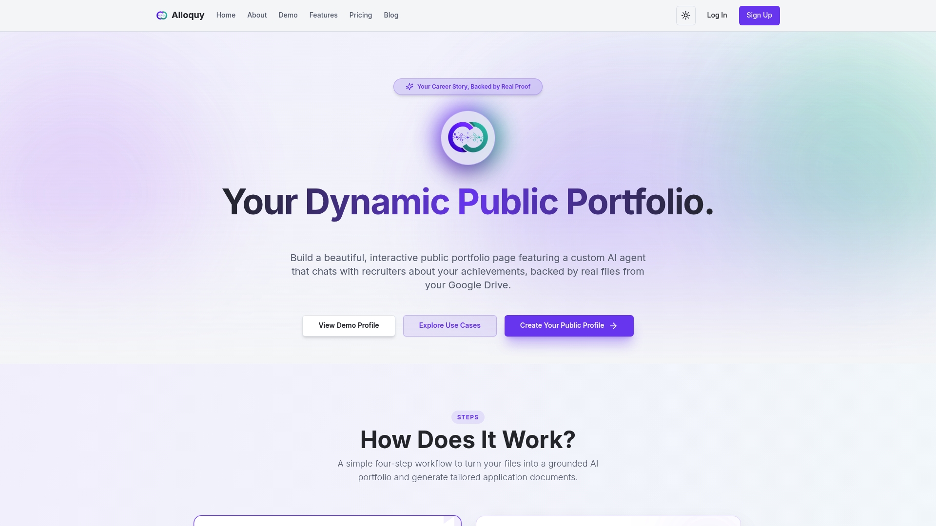
The platform maps directly to the problems this article describes. Interactive case studies replace static thumbnails. Customizable themes let you apply the layout patterns covered above. The AI assistant handles recruiter Q&A, so your portfolio works asynchronously across time zones. Tailored resume and cover letter generation pulls from the same verified evidence base, keeping every application document consistent with the portfolio record.
For designers ready to move from inspiration to implementation, explore Alloquy’s features or review pricing plans to find the tier that fits your current project volume and hiring goals.
Useful sources and galleries to explore
- 23 Inspiring Portfolio Website Examples & Tips
- Portfolio Layout Examples: 7 Patterns That Actually Get You Hired | The Crit
A note on responsible screenshotting: Save examples for personal reference only. Do not republish screenshots without crediting the original designer and linking back to their site. Most gallery sites link directly to the portfolio owner’s domain; use those links when sharing inspiration with collaborators.
For designers who want an integrated tool to implement the patterns above and publish a verified, interactive portfolio, Alloquy provides the evidence-linking and AI-assistant infrastructure that static portfolio builders do not.
Recommended
- 5 Critical Pitfalls Senior Engineers Must Avoid on Technical Portfolios | Alloquy Blog | Alloquy
- How to Highlight Product Impact When You Aren’t a Product Manager | Alloquy Blog | Alloquy
- Building an Unshakeable Personal Brand as a Technical Founder or Lead | Alloquy Blog | Alloquy
- Why Multi-Format Resume Assets Are Key to Modern Job Search Success | Alloquy Blog | Alloquy