

The strongest UX portfolio examples share one trait: they lead with outcomes, not activity. Show three to five deep case studies with your role stated plainly and results attached, and you clear the ten-second scan that filters most applicants. Treat any gallery you browse as a source of technique to steal, not a template to copy wholesale.
TL;DR:
- Show three to five case studies with clear outcomes at the top, using measurable results or impactful qualitative statements.
- Include a single sentence explaining your role in each project upfront and ensure the impact is visible before clicking into details.
- Build your homepage with your role, three project thumbnails with outcomes, and accessible contact info, all loading within three seconds on mobile devices.
- Use decision logs, annotated wireframes, and verifiable evidence like metrics snapshots to increase credibility and trust in your claims.
- Regularly update your portfolio by removing weak projects, adding new impactful work, and optimizing for role-specific content and accessibility.
Table of Contents
- The Best UX Portfolio Examples and What to Steal From Each
- Case Study Anatomy: A Structure Hiring Managers Can Actually Scan
- The Red Flags That Get Portfolios Filtered, and How Fast to Fix Them
- What Your Homepage Needs to Survive the First Scan
- How Many Projects to Show and How to Pick Them
- Choosing a Platform: Custom Site, Site Builder, or Notion
- Interactive, Evidence-Backed Case Studies: The Next Step Up
- Tailoring Your UX Portfolio for the Role You Actually Want
- Why Narrative Flow Determines Whether Anyone Finishes Reading
- Keeping Your Portfolio Current Without Redoing It Every Month
- Alloquy Turns Verified Work Into a Portfolio Recruiters Can Interrogate
- Author Perspective: The Three Changes That Actually Move the Needle
- Sources
- FAQ
The Best UX Portfolio Examples and What to Steal From Each
Curated galleries are useful for pattern recognition, not blueprints. Reviewers consistently rate proof of impact over visual polish, which is why the galleries themselves flag outcome evidence as the differentiator between portfolios that get shortlisted and ones that get closed after five seconds.
Here is what to lift from each source, and why it works against the hiring-manager scan heuristic (the quick pass for role fit, seniority signal, and immediate usefulness):
- Bestfolios curates hundreds of live portfolios by role and industry. Copy the thumbnail pattern where the strongest entries state a one-line outcome (“Cut checkout drop-off 18%”) directly under the project image, so the result is visible before a click.
- Wall of Portfolios groups examples by seniority level. The junior-to-senior contrast is instructive: senior portfolios put role and scope in the first sentence of every case study, while junior ones bury it in paragraph three.
- UXfol.io hosts portfolios built specifically on its own templates. Its best examples show the decision story front and center, meaning you see the two or three options a designer weighed before landing on a solution, not just the final screen.
- Muzli’s Figma Resource Library offers portfolio templates and layout kits UX designers actually use. The pattern worth copying is a homepage that surfaces role and thumbnail outcomes without scrolling, which mirrors the Muzli finding that hiring managers respond to visible role and outcome summaries before they read a single case study.
Individual standouts across these collections tend to share a decision-log approach: annotated Figma flows showing what was tried, what got rejected, and why. That single habit does more for credibility than another polished mockup ever will.
Case Study Anatomy: A Structure Hiring Managers Can Actually Scan
A case study that survives a rushed review follows a repeatable shape. Reviewers are pattern-matching for judgment and results, and a proven case study formula gives them both in the order they expect.
- Setup (1 to 2 lines). State the product, the business context, and the problem. Example: “A logistics dashboard used by 400 warehouse managers had a 40% support-ticket rate tied to order status confusion.”
- Role and constraints. Name exactly what you owned versus the team. Example: “I led research and interaction design across two sprints, working within an existing design system and a four-week deadline.”
- Decisions and alternatives. Show two or three paths you considered and why you rejected the others, not just the winning idea.
- Validation and metrics. Include the test method (moderated usability sessions, A/B test, analytics dashboard) and the actual result.
- Outcome. State the measurable or qualitative business/user result. Example: “Support tickets related to order status dropped 27% in the eight weeks after launch.”
- Reflection. One or two honest sentences on what you’d change, which signals maturity more than any visual polish does.
Back each section with an artifact: annotated wireframes for decisions, a redacted analytics snapshot for validation, a test script excerpt for methodology. Artifacts turn claims into evidence.
Pro Tip: Write your outcome line before you write anything else in the case study. If you can’t state a measurable or qualitative result in one sentence, the project probably isn’t ready to publish yet.
The Red Flags That Get Portfolios Filtered, and How Fast to Fix Them
Certain mistakes recur across rejected portfolios, and most take less time to fix than designers expect. The most common failure points are structural, not aesthetic.
- No outcomes stated. Fix in 24 hours: rewrite every thumbnail and case study intro to include a one-line result, even a qualitative one like “adopted by three regional teams.”
- Too many shallow projects. Fix within a week: cut down to three to five deep case studies and archive or delete the rest.
- Unclear role on team projects. Fix in 24 hours: add a single “My Role” line naming what you owned versus what teammates handled.
- Slow or broken mobile experience. Fix within a week: compress images, test load time on a phone, and eliminate any horizontal scroll or broken embed.
- Hidden contact information. Fix in 24 hours: put email and LinkedIn in the header and footer, not buried on a separate “Contact” page.
- No reflection or lessons learned. Longer-term fix: revisit each case study monthly and add one honest sentence about what you’d change now.
Prioritize by effort versus payoff. Outcome lines and contact visibility take an afternoon. Curating down to five strong projects takes a week of honest editing.
What Your Homepage Needs to Survive the First Scan
Hiring managers and recruiters give an initial review somewhere between two and eight minutes, and a slow or broken homepage often ends that review before any case study gets opened.
Your homepage needs, without scrolling:
- Your role and specialization stated in plain language (not just a job title)
- Three project thumbnails, each with a one-line outcome
- Visible email and LinkedIn, not hidden behind a contact form
- Mobile load time under three seconds, with compressed images and a responsive layout
- A page title and meta description containing your name and UX role, for search and AI parsing
- Clear H1 and structured headings on every case study page
A homepage showing three outcome-labeled thumbnails and a visible role reduces cognitive load enough to measurably increase interview callbacks, according to the same portfolio research that shapes the case study formula above.
How Many Projects to Show and How to Pick Them
Three to five deep case studies is the range that most hiring scenarios reward: juniors can lead with three or four strong projects, while mid-to-senior designers should curate four to six. Add one or two smaller demos only if they show a distinct skill your main projects don’t.
- List every project you’ve shipped or contributed to, then score each on relevance to your target role, evidence of measurable impact, and clarity of your specific contribution.
- Cut anything scoring low on two of the three. A visually pretty project with no clear role or outcome does more harm than good.
- Order what’s left by strength, leading with the case study that most closely matches the job you want next.
Choosing a Platform: Custom Site, Site Builder, or Notion
A custom-built site gives full control over layout and load speed, but costs setup time you may not have during an active job search. A site builder or portfolio-specific template gets you live faster and usually handles mobile responsiveness automatically, which matters more than it sounds given how quickly slow pages get closed.
Notion works as a fast, editable stopgap, particularly for early-career designers iterating on case study structure before committing to a final design. It’s rarely the strongest long-term home for a portfolio, since customization and performance both lag behind a dedicated site.
Whatever you choose, build toward:
- A thumbnail-first homepage where outcomes are visible before a click
- Single-case deep pages instead of one long scrolling document
- Accessible typography and contrast that hold up on mobile screens
Migrate off a temporary platform once you’re sending your portfolio link regularly in applications. That’s the point where load speed, custom branding, and search visibility start affecting outcomes rather than just convenience.
Interactive, Evidence-Backed Case Studies: The Next Step Up
Static case studies rely entirely on your writing to convince a skeptical reviewer. Interactive, evidence-backed portfolios let recruiters verify claims directly, which builds trust faster and holds up better when a portfolio gets parsed by AI tools during initial screening rather than read start to finish by a person.
Adding verifiable evidence to a case study means:
- Linking a redacted analytics snapshot instead of just stating a percentage
- Including a summarized usability test script rather than a paraphrased claim
- Getting stakeholder permission before sharing anything proprietary
- Using annotated screenshots that show your actual decision trail, not a polished after-the-fact recreation
Pro Tip: Start with one evidence item per case study, like a single redacted metrics screenshot. Once that habit feels routine, consider an interactive case study format that lets a recruiter ask follow-up questions without needing you on a call.
Tailoring Your UX Portfolio for the Role You Actually Want
A portfolio for a product design role at a fast-moving startup should look different from one aimed at a UX research position inside an enterprise company. Product design portfolios need to show end-to-end ownership: a problem, a range of explored solutions, and a shipped result with metrics attached; research-heavy roles need the opposite emphasis. A UX research portfolio should foreground methodology (how you recruited participants, which method you chose and why) and show how your findings actually changed a decision, not just that you ran a study.
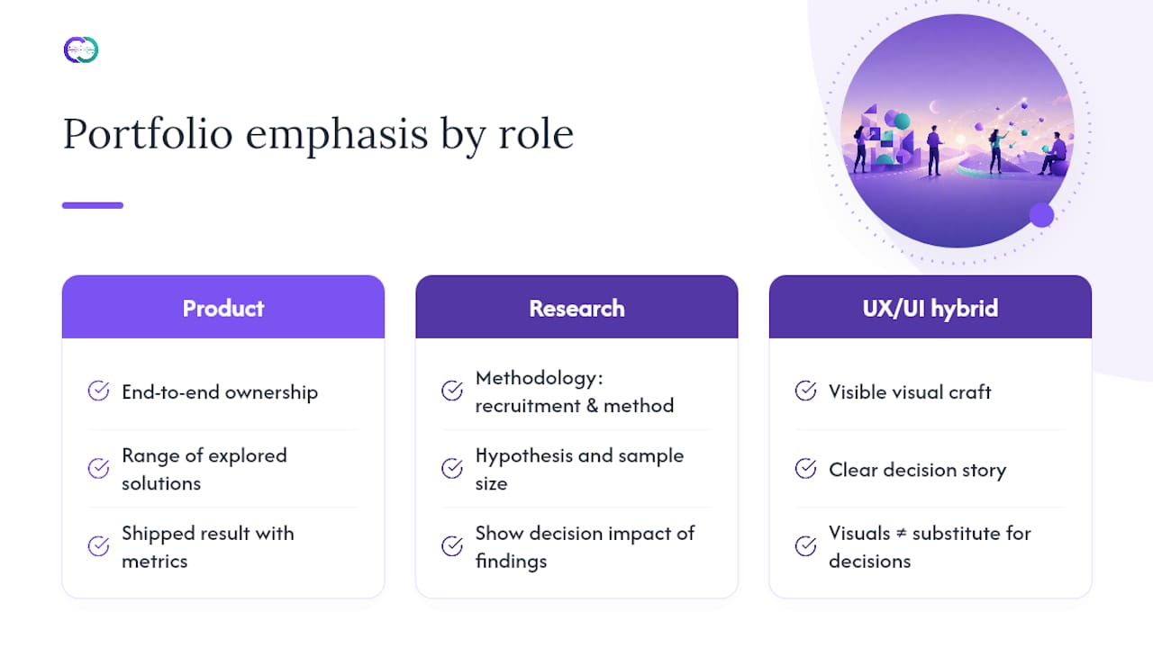
For UX/UI hybrid roles common at smaller companies, keep visual craft visible but never let it substitute for a decision story. For enterprise or regulated industries (healthcare, finance, government), lean harder on accessibility considerations and compliance-aware decisions, since those employers screen for that awareness specifically.
If you’re targeting several role types at once, don’t try to serve every audience with one homogenized case study. Build two or three case studies with different emphases, or write distinct summary blurbs for the same project depending on which skill you want to foreground. A designer job-hunting across both product and research roles might present the same project as a design decision story on one page and a research-methodology story in a different write-up.
Match your language to the audience too: a research-focused reviewer wants to see “hypothesis,” “sample size,” and “method,” while a product-focused reviewer responds more to “trade-off,” “constraint,” and “shipped.”
Why Narrative Flow Determines Whether Anyone Finishes Reading
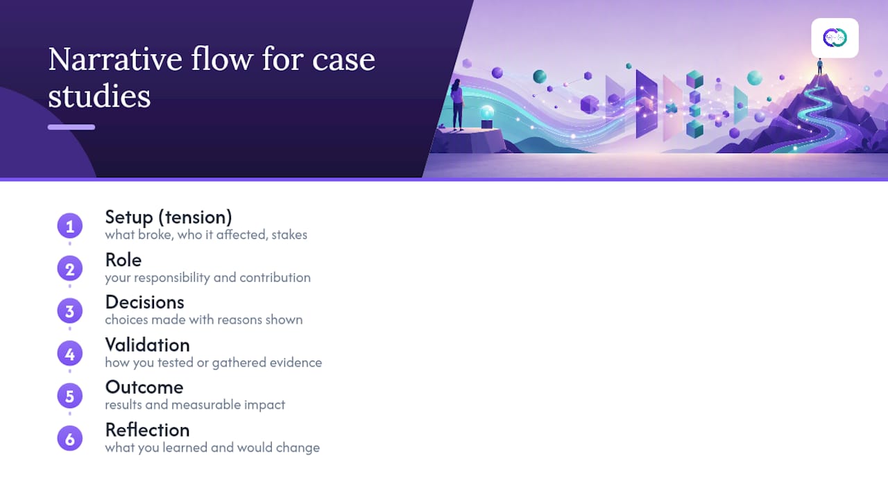
A case study with all the right sections in the wrong order still fails. The most common storytelling mistake is opening with process detail before establishing why anyone should care. Lead with tension: what was broken, who it affected, and what was at stake, before describing what you built.
Once the stakes are set, structure the middle section as a sequence of decisions rather than a list of deliverables. “I created wireframes, then a prototype, then tested it” describes activity, not judgment. “I tested two navigation patterns because early interviews showed users didn’t trust a hidden menu, and the simpler pattern won” shows reasoning a hiring manager can actually evaluate.
Keep transitions tight between sections. Each part of the anatomy outlined earlier (setup, role, decisions, validation, outcome, reflection) should read as the natural next question a curious reviewer would ask, not a checklist you’re working through. If a section feels like a non sequitur, that’s usually a sign a step got skipped rather than that the section needs more words.
End every case study with the reflection line, even a short one. It’s the detail most portfolios skip, and it’s the one that most signals to a hiring manager that you learn from your own work rather than just execute it.
Keeping Your Portfolio Current Without Redoing It Every Month
Treat your portfolio like a living product rather than a one-time deliverable. A portfolio that never changes signals a lack of iteration, which is exactly the opposite of what UX hiring managers are screening for.
Set a light maintenance cadence instead of a full rebuild schedule. Every time you finish a meaningful project, decide within a week whether it replaces a weaker existing case study; if it does, archive the old one rather than letting your portfolio grow to eight or nine diluted entries. Revisit your outcome metrics quarterly, since a number that mattered a year ago (a launch metric, a pilot result) often has a better follow-up data point by now if the project shipped and matured.
Update your homepage thumbnails whenever your target role shifts, even if the underlying case studies stay the same. Swapping which three projects lead, and which outcome line you feature, takes an hour and can realign your entire portfolio toward a new job search without touching the deep content.
Alloquy Turns Verified Work Into a Portfolio Recruiters Can Interrogate
Every recommendation in this guide points toward the same conclusion: portfolios win interviews when claims are backed by evidence a reviewer can actually check. Alloquy builds that verification directly into the platform. Link your Google Drive documents, and Alloquy converts them into an interactive AI assistant that recruiters can query directly about your case studies, turning a static outcome claim into a conversation backed by your actual work.
That matters most for early-to-mid career designers who lack a long track record to lean on. Instead of asking a hiring manager to trust a bullet point, Alloquy lets them ask “what was your specific role in this redesign?” and get an answer grounded in your linked evidence. The platform also generates tailored resumes and cover letters from that same verified data, and offers customizable branding and layout options so your interactive portfolio still looks and feels like your own work.
If you’re ready to move past a static case study page, Alloquy’s plans scale from a free tier with limited features up to expanded evidence storage and AI generation limits for designers actively job hunting.
Author Perspective: The Three Changes That Actually Move the Needle
Fix these in order: add a one-line outcome to every project thumbnail, make your role explicit in the first two lines of each case study, and get your mobile load time under three seconds. Do the first two today, curate down to five strong projects this week, and add one piece of verifiable evidence per case study by month’s end. A portfolio isn’t a resume attachment. It’s a product you keep shipping.
— Alloquy Team
Sources
- Why ‘Good’ UX portfolios NEVER get interviews in 2026! (11 Hiring Red Flags)
- How to Build a UX Portfolio That Actually Gets You Hired (2026) | Muzli Blog
- 12 Portfolio Mistakes That Cost Designers Interviews (And How to Fix Them) | The Crit
- UX Portfolio Tips: What Hiring Managers Actually Evaluate | UX Designer Salary
FAQ
What should a UX portfolio have?
A strong UX portfolio needs three to five deep case studies with a clear setup, your specific role, the decisions you made, measurable or qualitative outcomes, and a brief reflection, plus visible contact information and fast mobile performance.
What are some examples of top UX portfolios?
Galleries like Bestfolios, Wall of Portfolios, UXfol.io, and Muzli’s Figma resource library curate strong examples by role and seniority, and the best entries across them all lead with a one-line outcome rather than a polished screenshot alone.
What pays better, UX or UI?
UX and UI compensation overlaps heavily since many roles blend both, though UX-focused positions with research and strategy responsibilities often command higher salaries at larger companies than purely visual UI roles.
What does a UX researcher portfolio look like?
A UX research portfolio foregrounds methodology (recruitment, method choice, sample size) and shows how findings changed a real product or business decision, rather than emphasizing visual design work.