

A portfolio palette should be restrained: 3 to 5 colors, a neutral base, and one controlled accent. That constraint isn’t a limitation on creativity; it’s what keeps the viewer’s eye on the work instead of the wrapper. Apply role-based proportions (roughly 70-20-10), and confirm every text and UI pairing clears accessibility contrast before you call the system finished.
TL;DR:
- Limiting your portfolio palette to three to five colors, with a neutral canvas and one accent, helps maintain visual cohesion and focus viewers on your work.
- Assign role-based colors using the 70-20-10 rule: dominant neutral for backgrounds, supporting tones for text and borders, and a single saturated accent for UI highlights.
- Always verify contrast levels according to WCAG thresholds before publishing, testing with real content and in different modes like dark mode.
- Base your color choices on the emotional tone you want to communicate, aligning with your target industry and audience rather than industry stereotypes.
- Use real project images and outside feedback to audit your palette, ensuring it harmonizes across print, web, and mobile formats before finalizing.
Table of Contents
- Why Portfolio Color Palettes Shape First Impressions
- The 70-20-10 Rule and Role-Based Color Assignment
- 12 Ready-to-Use Portfolio Color Palettes
- How to Choose a Palette for Your Work and Audience
- Tools and a Testing Checklist for Portfolio Palettes
- How Alloquy Applies Palette Systems to Verified Portfolios
- The Psychology Behind Portfolio Color Choices
- Portfolio Color Trends Across Creative Industries
- Adapting a Palette Across Print, Web, and Mobile
- Common Portfolio Palette Mistakes to Avoid
- What the Palette Debate Gets Wrong
- Preview Your Palette on Alloquy Before You Publish
- Sources
- FAQ
Why Portfolio Color Palettes Shape First Impressions
Color is the first signal a visitor reads, before they’ve scrolled past your name; understanding the psychology of colors in marketing can boost your brand’s impact from that very first glance. It sets an unspoken expectation: is this person buttoned up, or a wild card? A palette skewed toward cool blues and grays reads as measured and professional, while warm reds and oranges signal energy and creative confidence. Research on color psychology in graphic design backs this up directly: cool tones increase perceived professionalism, warm tones increase perceived creativity. Neither is “correct.” The choice depends on who’s viewing the site and what you want them to conclude in the first three seconds.
The harder problem isn’t picking a mood, it’s coexistence. Portfolios showcase dozens of images shot in different lighting, branded in different client colors, styled in different eras of your work. A loud site palette fights every one of those images for attention. A quiet one lets them breathe.
That’s the practical case for restraint:
- A neutral surface (background, cards, dividers) accommodates wildly different project thumbnails without visual conflict.
- One accent color does the job of guiding attention to buttons, links, and calls to action, so the eye always knows where to click next.
- Consistent color application also builds recognition. Zion & Zion’s research finds that strategic, repeated color use can boost brand recognition by as much as 80%, which matters when a recruiter is scanning ten portfolios in one sitting and yours needs to stick.
- Design practitioners increasingly argue for a “surface first” build: start with canvas, text, and one accent, then subtract before you add, according to ColorArchive’s portfolio color guidance.
The 70-20-10 Rule and Role-Based Color Assignment
Most portfolio color failures aren’t about bad taste. They’re about too many colors doing too many jobs with no clear hierarchy. Fix that by assigning explicit roles before you touch a hex code:
- Canvas/background: the dominant neutral. Off-white, warm gray, or deep charcoal, depending on light or dark mode.
- Primary text: high-contrast against the canvas, used for headlines and body copy.
- Secondary text: a softer gray or muted tone for captions, dates, and metadata.
- Border/divider: a subtle line color, usually a step or two lighter or darker than the canvas.
- Accent: one saturated color reserved for buttons, links, and highlight moments. Nothing else touches it.
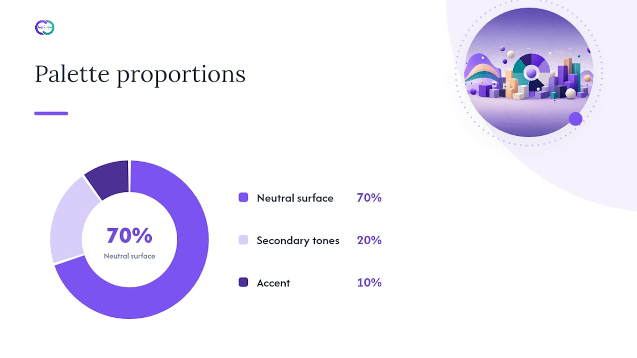
The standard proportion designers reach for is 70-20-10: 70% neutral surface, 20% secondary tones (text, borders, supporting UI), and 10% accent. On an actual layout, that plays out as a neutral header and body background, secondary-toned navigation and captions, and an accent color that shows up only on the “Contact me” button, active nav state, and maybe a single underline treatment on your name.
Pro Tip: Count your accent uses on a single page. If you can’t count them on one hand, the accent has stopped being an accent.
Contrast is not optional at this stage. University of Maryland’s accessibility guidance sets the working thresholds: 4.5:1 for body text against its background, and 3:1 for large text and UI components like buttons and icons. Those numbers come from WCAG 2.1, and they apply to your accent-on-canvas pairing just as much as your text-on-canvas pairing. A palette that looks balanced in a swatch tool can still fail contrast the moment you drop in real copy.
12 Ready-to-Use Portfolio Color Palettes
Each system below lists roles and hex codes you can drop straight into a style sheet. Keep the accent small, and treat any dark background as deep charcoal or navy rather than true black, per the same University of Maryland guidance on visual weight.
1. Warm Minimal
Canvas #FAF8F5, primary text #1E1B18, secondary text #8A8178, border #E4DED6, accent #D97B4F. A soft terracotta accent against a warm off-white canvas. Fits editorial and lifestyle portfolios where the work itself is warm toned.
2. Cool Corporate
Canvas #F7F9FB, primary text #12232E, secondary text #5C6B76, border #DCE3E8, accent #2A6DB0. Blue reads as trustworthy fast, which is why consulting and product-management portfolios lean on it constantly.
3. Charcoal Editorial
Canvas #1C1F22, primary text #F2F0ED, secondary text #9A9EA3, border #33373B, accent #E8B94B. A dark-mode system built on charcoal instead of black, with a mustard accent that stays legible without glowing.
4. Sage and Clay
Canvas #F3F0EA, primary text #2B2A27, secondary text #6E6A62, border #DDD6C9, accent #8A7A5E. A muted, earthy palette that works well for architecture and interior-design portfolios where images already carry strong color.
5. Tech Slate
Canvas #0F1115, primary text #EDEFF2, secondary text #8B929B, border #242832, accent #5B8CFF. Dark UI with a cobalt accent. Common in developer and product-design portfolios, since it echoes the code editors those viewers live in. Pair with our developer portfolio examples for layout ideas that fit this system.
6. Cream and Ink
Canvas #FCFAF6, primary text #191919, secondary text #767676, border #E9E4DA, accent #B23A2E. High contrast, low color count. The brick red accent is confident without shouting; a strong fit for writers and photographers.
7. Muted Rose Studio
Canvas #FBF6F5, primary text #2B2223, secondary text #8C7A7B, border #EBDFDF, accent #B8637A. A softer, warmer alternative to the usual blue accent, popular with fashion and branding designers who want approachable rather than corporate.
8. Deep Navy Professional
Canvas #0E1B2A, primary text #F0F3F6, secondary text #8FA0AF, border #1E2E42, accent #4FD1C5. Navy instead of black solves the visual-weight problem directly, and the teal accent keeps the dark mode from feeling heavy.
9. Paper and Graphite
Canvas #F5F4F2, primary text #232323, secondary text #767676, border #D9D7D3, accent #3D3D3D. A near-monochrome system where the “accent” is just a darker gray used for emphasis. Works when the portfolio images provide all the color.
10. Bold Coral Creative
Canvas #FFFDFB, primary text #20201F, secondary text #83807C, border #EDE7E0, accent #FF5A4E. A high-energy accent against an otherwise quiet canvas. Best for motion designers and illustrators whose work already reads as playful.
11. Forest Editorial Dark
Canvas #14201B, primary text #EAEFE9, secondary text #8FA096, border #233029, accent #7FBF7A. Deep green instead of navy or charcoal, a less common but distinctive dark-mode choice for sustainability, outdoor, or product-design portfolios.
12. Amber and Slate
Canvas #F6F5F3, primary text #1F1F1F, secondary text #727272, border #E0DDD8, accent #E0A028. A gold accent that reads premium rather than playful, a fit for consultants and senior-level case-study sites. Pair it with our portfolio case study guide when structuring the accent around a single “results” callout.
How to Choose a Palette for Your Work and Audience
Picking a palette in isolation is how most portfolios end up mismatched to the work inside them. Work through it in order:
- Audit your quietest and loudest projects side by side. Pull thumbnails from your most muted piece and your most saturated piece. If a candidate palette clashes with either extreme, drop it. CColorPalette’s guidance on portfolio palettes makes this the first real test, not the swatch preview.
- Define the emotional goal before the hex codes. Are you selling trust (consulting, engineering, product management) or creative spark (branding, illustration, motion)? Cool tones skew toward the former, warm tones toward the latter, but the honest answer is: match the tone to the audience and the medium, not to a stereotype about your profession.
- Prototype on real pages, not isolated swatches. Drop the palette into an actual project grid, a case-study header, and a contact form. Check readability at normal viewing distance, then tab through the page with a keyboard to confirm focus states are visible against your accent color.
- Get one round of outside feedback before you lock it. A second set of eyes catches the clash you’ve stopped seeing after twenty hours of staring at the same three hex codes.
If the accent color still jumps out, it’s doing its job. If the whole page reads as one flat block of color, your ratios are off.*
Color functions as a communication system here, not decoration. Every choice should aim at the specific feeling you want a hiring manager to walk away with, a point Mindstream Creative’s work on color psychology and branding makes well: pick colors for the reaction, not the trend.
Tools and a Testing Checklist for Portfolio Palettes
Building the palette is the easy half. Validating it against real content is where most portfolios quietly fail. Run through these categories before publishing:
- Palette generators (Coolors, Adobe Color) for building candidate systems fast, then narrowing to 3 to 5 finalists.
- Contrast checkers, like the WebAIM contrast checker, to confirm every text and UI pairing meets WCAG 2.1 thresholds: 4.5:1 for body text, 3:1 for large text and interactive elements.
- In-browser previews rather than static mockups, since real fonts, real image compression, and real screen brightness all shift how a color reads.
- Design-file mockups (Figma, Sketch) for checking the palette against actual layout spacing before it goes live.
Once the palette passes those tools, run the in-context flow: overlay your loudest and quietest project thumbnails against the canvas color, flip to dark mode if you offer one, tab through the page with a keyboard to confirm every focus state is visible, and check the whole thing at mobile scale, where UI elements shrink and thin accent lines can disappear entirely.
How Alloquy Applies Palette Systems to Verified Portfolios
Alloquy builds theme customization around the same role-based logic covered above: canvas, text, and accent are configurable independently, so a designer can test a palette against their own uploaded work rather than a generic template screenshot. Because Alloquy profiles link directly to Google Drive documents and evidence-backed case studies, a palette gets validated against the actual content a recruiter will query, not a placeholder image.
The platform includes dark-mode preview and exportable style tokens, so a system built for a resume PDF stays consistent when it’s applied to the public profile and any AI-generated application documents. That consistency matters more on Alloquy than on a static site, since the AI assistant surfaces verified achievements in context. A coherent palette keeps that experience from feeling patched together across formats.
The Psychology Behind Portfolio Color Choices
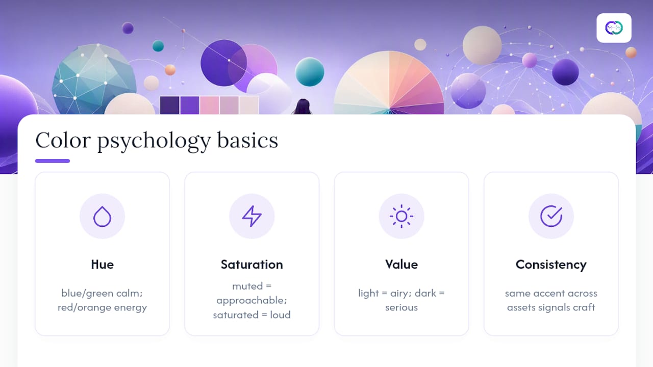
Color theory for portfolios boils down to a handful of working principles, not an art-school lecture. Hue carries the emotional signal: blues and greens toward calm and competence, reds and oranges toward energy and urgency, per the same color psychology research cited earlier. Saturation controls intensity. A muted rose reads as approachable; a saturated magenta in the same hue family reads as loud. Value, meaning how light or dark a color sits, controls legibility and mood: high-value palettes feel airy and open, low-value palettes feel serious or premium.
None of that is a hard science, and profession-based stereotypes (“engineers use blue, artists use bright colors”) deserve real skepticism. Mailchimp’s color psychology guidance makes the point directly: base your choice on the medium, the audience, and the colors already present in your work rather than on genre assumptions. A landscape photographer’s earthy work might call for a warm palette even though photography sites often default to stark black and white. A fintech product designer’s clean UI screenshots might actually call for a slightly warmer accent to offset how cold the work already looks.
The one principle worth treating as close to fixed: consistency signals craft. A recruiter who sees the same accent color on your case study, your resume PDF, and your contact button reads that as attention to detail, according to research on warm versus cool color psychology. Inconsistency reads as rushed, regardless of how good any single page looks.
Portfolio Color Trends Across Creative Industries
Palette conventions shift by field, and knowing the local norm helps you decide when to follow it and when to break it on purpose. Tech and product-design portfolios have drifted hard toward dark UI systems (slate backgrounds, a single cobalt or teal accent) because that’s the aesthetic of the tools the audience uses daily. Branding and marketing portfolios lean warmer and bolder, since the work itself is often built to grab attention, and a quiet site would undersell it.
Editorial and photography portfolios trend toward near-monochrome systems: a paper-toned canvas, near-black text, and an accent so restrained it barely registers as a color choice, letting the images carry all the saturation. Architecture and interior-design portfolios favor earthy, muted palettes (sage, clay, sand) that echo material palettes rather than screen palettes. Consulting and enterprise-facing portfolios still default to navy and gray, a safe choice that reads as credible to a corporate audience, even as younger candidates in the same fields experiment with warmer accents to stand out.
None of these are rules. They’re defaults, and a system consistent with your own work will always outperform a system that’s merely fashionable within your industry.
Adapting a Palette Across Print, Web, and Mobile
A palette that reads correctly on a laptop screen does not automatically survive translation to a resume PDF or a phone. Screens emit light; paper reflects it. A hex color that looks crisp on an RGB display can print muddy or shift hue entirely once converted to CMYK, so any palette meant to appear in a printed resume or leave-behind needs a CMYK proof, not just a screen check.
Mobile compresses everything. Accent lines that read clearly at desktop width can shrink below a visible threshold on a five-inch screen, and secondary text that passes contrast at 16px can fail once a responsive layout drops it to 13px. Test your smallest UI text at actual mobile size, not just the desktop mockup.
Web gives you the most flexibility, including dark mode, hover states, and animated accents, but that flexibility is also where inconsistency creeps in fastest. Lock your role assignments (canvas, text, accent) as design tokens once, then apply them identically across your site, your PDF exports, and any generated application documents, so the same visual identity holds no matter which format a recruiter opens first.
Common Portfolio Palette Mistakes to Avoid
Most weak portfolio palettes fail for the same handful of reasons, and every one of them is fixable before launch.
Too many accent colors. The moment a second or third saturated color competes for attention, the viewer stops trusting any of them to mean something. Pick one accent and enforce it everywhere.
Pure black backgrounds. Full #000000 creates harsh contrast against white text and increases eye strain across a long scroll. Deep navy or charcoal deliver the same dark-mode mood with less visual weight, as the University of Maryland’s accessibility guidance recommends.
Choosing colors before auditing the work. A palette selected in a vacuum, then forced onto existing project images, almost always clashes with something. Audit first, choose second.
Skipping contrast checks on UI elements, not just body text. Designers remember to check paragraph contrast and forget that button labels, nav links, and form placeholders need the same 4.5:1 or 3:1 thresholds.
Following industry stereotypes instead of your actual work. Blue-for-tech and black-for-photography are defaults, not laws. A palette that fights your actual images to satisfy a genre convention is a mistake twice over.
Treating the palette as decoration instead of a system. Colors without assigned roles get applied inconsistently page to page, which undercuts the recognition benefit consistent color use is supposed to deliver in the first place.
What the Palette Debate Gets Wrong
Most portfolio advice treats color choice as a taste problem, when it’s really a discipline problem. The designers who struggle aren’t the ones with bad instincts. They’re the ones who never wrote down what each color is allowed to do, so an accent creeps into three unrelated places and the whole system stops reading as intentional.
The conventional wisdom oversells personality and undersells restraint. A portfolio isn’t a poster; it’s a viewing environment for other work, and the palette’s job is to disappear at the right moments and appear only where it earns attention. That’s why the 3 to 5 color ceiling and the 70-20-10 split matter more than which specific hues you pick.
If you take one thing from this, take the audit step. Test any palette against your quietest and loudest project before you commit, not after. Everything else, hex codes, trend direction, industry convention, is negotiable. That single habit is not.
— Alloquy Team
Preview Your Palette on Alloquy Before You Publish
Testing a palette in isolation only gets you so far. Alloquy lets you preview theme colors directly against your own uploaded work, so the canvas, text, and accent roles you choose get validated against real case studies rather than a generic template. Because those case studies are evidence-backed, linked to your actual Google Drive documents, your palette decisions carry through to a portfolio a recruiter can genuinely trust, not just admire.
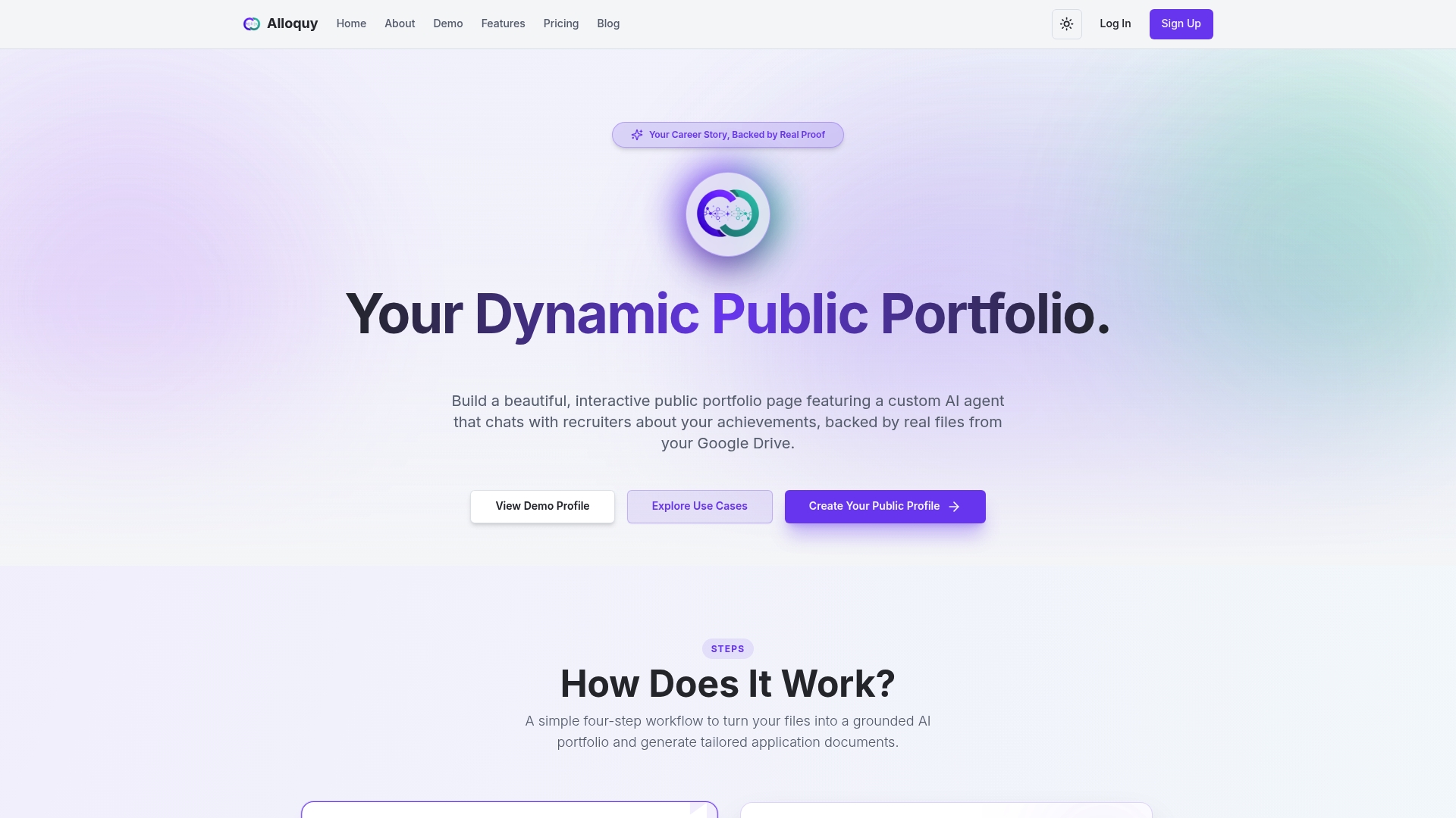
Set up your theme, drop in your verified projects, and check contrast and legibility on the actual pages recruiters will see, including dark mode. From there, Alloquy can generate a tailored resume and cover letter that inherit the same visual identity, so your palette stays consistent from public profile to application document. Start on the free plan or compare paid options to see which tier fits your evidence storage and AI generation needs, or visit the Alloquy platform to build your first themed profile today.
Sources
- Portfolio color palette guidance — Piktochart
- Platt
- How color theory drives design — Zion & Zion
- Color contrast guidance and tools — University of Maryland accessibility resources
FAQ
What is the best color palette for a portfolio?
There’s no single best palette, but the strongest ones share a structure: 3 to 5 colors, a neutral canvas, and one controlled accent applied at roughly a 70-20-10 ratio. The right hues within that structure depend on your industry and audience.
Which color is good for a portfolio?
Cool colors like blue and teal tend to read as professional and trustworthy, while warm colors like coral and amber read as energetic and creative, according to color psychology research. Choose based on the impression you want a viewer to form, not a fixed rule.
What is the 3-color rule in design?
The 3-color rule suggests limiting a design to three main colors, typically a dominant neutral, a secondary supporting tone, and one accent, to keep a layout visually cohesive. Portfolio guidance extends this slightly to a 3 to 5 color range to accommodate text, borders, and UI states separately.
What is Gen Z’s favorite color?
There’s no single verified consensus figure on a favorite color for this age group, and definitions and survey methods vary widely across sources. Rather than chasing a demographic trend, base your portfolio palette on your actual work and the impression you want a specific hiring audience to form.
Can Alloquy help me test a color palette against my real projects?
Yes. Alloquy’s theme customization lets you preview canvas, text, and accent colors directly against your uploaded, evidence-backed case studies, including a dark-mode view, so you can catch contrast or clash issues before publishing your public profile.