

A converting one-page portfolio does one thing above all else: it moves a visitor from first impression to a single, committed action without friction. The structure is a focused marketing asset that answers three questions within seconds — who you are, what you do, and who you help — then delivers one clear next step, whether that is booking a call, reviewing a proposal, or making contact. Research confirms that portfolios failing to answer those three questions in the hero block lose visitors before a single project is seen.
Start here, in the next hour:
- Choose your primary CTA first. Every layout decision flows from this: “Book a discovery call,” “View my rates,” or “Hire me for your next project.” One action, stated once, placed prominently.
- Select your three best projects. Not your most recent, not your most technically complex. The three that best prove you can solve the problem your ideal client has right now.
- Write your hero value statement. One sentence: what you do, for whom, and what outcome they get. Anchor it with a measurable result or a short client attribution if you have one.
Those three moves define the skeleton. Everything else in this guide builds the muscle around them.
Key Takeaways
A converting one-page portfolio leads with a single primary CTA, proves capability with 3–5 curated case studies in the Brief → Approach → Result → Tech format, and ships with performance and accessibility guardrails in place before the first share.
| Point | Details |
|---|---|
| CTA-first structure | Define your primary call to action before designing anything; every layout decision follows from it. |
| 3–5 curated projects | More projects dilute positioning; show only the work most relevant to your target client. |
| Signature moment | Protect one memorable interaction; keep everything else static to preserve performance and focus. |
| LCP under 2.5s | Preload the hero image, convert to WebP, and lazy-initialize heavy modules before launch. |
| Alloquy for verified portfolios | Alloquy adds document-linked evidence and recruiter AI chat to a one-page portfolio, turning static claims into queryable proof. |
Table of Contents
- Where should you look for one-page portfolio inspiration?
- What sections does a one-page portfolio actually need?
- Which design principles make a single-page portfolio memorable?
- How do you build a one-page portfolio in one to two weeks?
- How do you write case studies that convert on a single page?
- What content templates can you use right now?
- Why does verifiable evidence make a portfolio more trustworthy?
- The case for interactive portfolios over static pages
- Publish your verified portfolio with Alloquy
- Sources
- FAQ
Where should you look for one-page portfolio inspiration?
Visual inspiration is everywhere, but undirected browsing produces derivative work. The productive approach is to visit curated galleries with a specific extraction goal: OnePageLove for layout and scroll rhythm, Awwwards for motion and signature interactions, Dribbble and Behance boards for photography treatment and color systems. The Webflow blog’s design portfolio examples offer a well-annotated set of patterns worth studying for how motion and micro-interactions guide attention without overwhelming the content.
What to extract from each source:
- Layout: How is the grid structured? Single column, asymmetric two-column, or a card strip?
- Motion: Is animation serving navigation (scroll-triggered reveals, sticky headers) or pure decoration? Decoration is a performance liability.
- Photography and visual treatment: Masked images, full-bleed heroes, editorial white space.
- Copy rhythm: Short declarative headlines, subheads that qualify the claim, project blurbs under 30 words.
The discipline is translation, not imitation. Identify one visual idea — a masked hero image, a cinematic scroll-driven reveal, a minimal editorial grid — and ask how it would work within your content constraints. That single extracted idea becomes your signature moment. Mood board prompts that work well: “minimal editorial with generous whitespace,” “bold hero with masked portrait and one accent color,” “cinematic scroll-driven case reveal on dark background.”
A short ethical checklist before you borrow:
- Replace every identifiable asset (photos, logos, copy) with your own.
- Never lift CSS or JavaScript verbatim from a live site without an open-source license.
- Credit public template sources in your repository or footer when the license requires it.
Pro Tip: When you find a portfolio that stops you mid-scroll, screenshot the exact moment that caused it. That screenshot is your design brief for your own signature moment.
What sections does a one-page portfolio actually need?
The canonical structure is not arbitrary. Each block has a conversion purpose, and the sequence matters: identity first, proof second, action third. Minimalist portfolio research consistently supports this ordering because it mirrors how a recruiter or client evaluates a new contact.
- Hero. Answers who you are, what you do, and who you serve. Contains your primary CTA. Visitor goal: understand your value proposition in under five seconds.
- Social proof strip. One to three short client attributions, recognizable brand logos, or a single standout metric. Visitor goal: trust is established before they see a single project.
- Featured work / case studies. Three to five projects, each following the Brief → Approach → Result → Tech/Role template. Visitor goal: confirm you can solve their specific problem.
- Capabilities or process. A short list of services or a three-step process summary. Visitor goal: understand what working with you looks like.
- About / bio. Two to three sentences. Personality, not biography. Visitor goal: decide whether they want to work with this person.
- Contact / CTA. Repeat the primary CTA, add a secondary contact method (email or calendar link). Visitor goal: take the action.
Lower-value content — detailed testimonials, full project archives, press mentions — belongs behind expandable cards or a “more” toggle. Keeping it off the primary scroll path protects the conversion funnel without hiding the evidence entirely.
The case-study template that fits a single page
Freelancer portfolios convert best when each case study shows brief, approach, and measurable results rather than long galleries. The four-field template below keeps each project tight:
| Field | What to write | Target length |
|---|---|---|
| Brief | The client’s problem or the project goal | 1 sentence |
| Approach | The method, tools, or decisions that mattered | 2–3 sentences |
| Result | A quantitative or clearly qualitative outcome | 1 sentence |
| Tech / Role | Stack used and your specific contribution | 1 line |
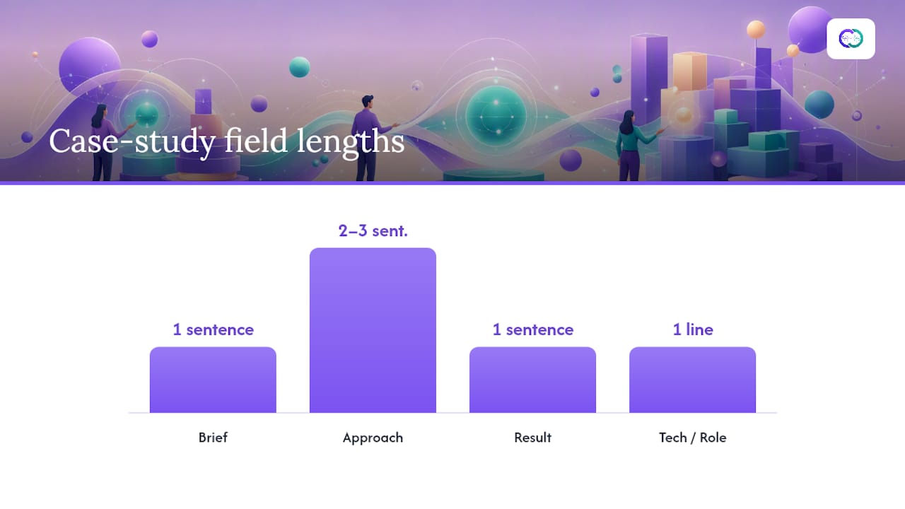
Expandable cards let you surface the Brief and Result on the primary scroll while hiding Approach and Tech behind a “Read more” toggle. The visitor sees proof immediately; the detail is available for those who want it.
Which design principles make a single-page portfolio memorable?
Restraint is the operative word. Hierarchy, contrast, and deliberate motion outperform decorative excess every time. Award-winning portfolios begin with a one-sentence concept, protect a single signature interaction, and require performance-focused engineering — a principle that scales down to a solo build just as well as it applies to agency-level work.
What a signature moment actually is
A signature moment is the single interaction that makes your portfolio memorable and unrepeatable. On a one-page format, it does not need to be complex. A hero image that reveals on load with a masked clip-path animation, a case-study card that expands with a smooth height transition, or a cursor that changes state over project thumbnails — each of these qualifies. The rule is that the signature moment must serve navigation or storytelling, not exist purely for visual effect. Protect it by keeping everything else static or near-static.

Performance is a conversion variable, not a technical afterthought
Targeting Largest Contentful Paint under 2.5 seconds is non-negotiable. The practical steps: preload or prioritize the hero image, convert all images to WebP, lazy-initialize heavy interactive modules (WebGL, 3D scenes, large GSAP timelines), and cap devicePixelRatio for canvas renderers to protect mid-range devices. When combining multiple motion systems — a smooth-scrolling library like Lenis, GSAP with ScrollTrigger, and a WebGL layer — a single synchronized animation loop prevents jank and inconsistent frame rates. Unsynced requestAnimationFrame calls are one of the most common performance failures in creative portfolios. Faster websites also rank and convert better, making speed a dual investment in both discoverability and client acquisition.
Pro Tip: Add prefers-reduced-motion media query support from day one. It takes under an hour to implement and protects users with vestibular disorders — while also signaling accessibility competence to any recruiter who inspects your code.
Accessibility guardrails that belong in every build: keyboard focus states on all interactive elements, color contrast ratios meeting WCAG AA (4.5:1 for body text), and a mobile-first layout that does not rely on hover states for critical information.
How do you build a one-page portfolio in one to two weeks?
Award-caliber solo builds typically run 4–8 weeks with a dedicated polish week. A focused one-page format compresses that timeline significantly when scope is disciplined.
- Day 1–2: Concept and content. Write your hero value statement, select three to five projects, and draft the four-field case-study template for each. Do not open a design tool until the copy exists.
- Day 3–4: Design. Build a wireframe in Figma or on paper. Confirm information hierarchy, CTA prominence, and contact flow before adding color or type. Choose your signature moment.
- Day 5–7: Build. For a no-code path, Webflow, Framer, or a Notion-based template gets you to a live URL fastest. For a lightweight custom build, a static-site generator (Astro, Next.js) with minimal JavaScript ships fastest and performs best. Avoid framework overhead you will not use.
- Day 8–9: Polish. Typography refinement, spacing consistency, mobile QA, and animation timing. This is where most portfolios either become memorable or remain generic.
- Day 10–11: Launch prep. Run the checklist below, then publish.
- Day 12–14: Share. Post to LinkedIn, submit to OnePageLove or Dribbble, and send direct links to five target contacts.
Launch checklist
- Heading structure: one H1 (your name or value statement), logical H2/H3 hierarchy for sections
- Section-level schema markup for better search indexing
- All images in WebP format, hero image preloaded
- Contact form tested end-to-end (submission confirmed, reply-to address correct)
prefers-reduced-motionimplemented- Mobile layout tested on at least two real devices, not just browser DevTools
- Visual content optimized for both search and social sharing (Open Graph tags, descriptive alt text)
- Analytics or micro-conversion instrumentation active before launch
Common pitfalls: shipping without mobile QA, using placeholder copy in the hero, forgetting to set a reply-to address on the contact form, and launching without any instrumentation. Tracking hero CTA conversion and case-card expand rates is the only reliable way to know whether your single-page funnel is working.
How do you write case studies that convert on a single page?
Clients convert more often when portfolios show process and measurable outcomes, not just screenshots. Real numbers or time-savings anchor perceived value in a way that visual-only presentations cannot. The four-field template from Section 3 applies here with specific copy guidance.
- Brief (1 sentence): State the client’s problem, not the deliverable. “The client needed to reduce checkout abandonment on mobile by improving the payment UX” is stronger than “Redesigned the checkout flow.”
- Approach (2–3 sentences): Name the decisions that mattered. Which research method? Which constraint shaped the solution? What did you choose not to do, and why?
- Result (1 sentence): Lead with the number or the outcome. “Checkout completion increased 23% within 60 days of launch.” If no metric exists, use a qualified qualitative outcome: “The redesigned flow was adopted as the company’s global standard.”
- Tech / Role (1 line): “Figma, Maze for usability testing. Lead designer, solo delivery.”
How many projects to include: three to five, as research on freelancer conversion consistently shows. More projects dilute positioning. If you have ten strong projects, show the five most relevant to your target client and link to a full case-study archive from the “more work” toggle.
Adding social proof without clutter:
- One short client attribution per featured project, placed directly below the Result field
- A logo strip (five to eight recognizable brands) in the social proof section above the work
- Avoid long testimonial blocks on the primary scroll; they interrupt the conversion flow
Pro Tip: Highlight product impact even when your role was not the lead. Engineers and designers often undersell contribution by omitting the measurable outcomes their work enabled. State your specific contribution and the outcome it produced, even if the project was a team effort.
What content templates can you use right now?
Hero headline templates by role
- Designer: “I design [product type] for [audience] that [measurable outcome].”
- Photographer: “[Adjective] photography for [industry] brands that need [emotional or commercial outcome].”
- Developer: “I build [stack/type] applications for [audience] — fast, accessible, and maintainable.”
- Product designer: “Product design that moves [metric] — [n] shipped features, [n] satisfied users.”
Subhead template: “Currently available for [engagement type] starting [month/quarter]. [CTA].”
Layout grid options
Single-column mobile-first works for most creative professionals. It forces content prioritization and performs best on mobile, where a significant share of portfolio traffic arrives. Use it when your work is primarily image-based and the scroll rhythm is the experience.
Two-column desktop layout suits developers and product designers who need to show text-heavy case studies alongside visuals. The left column carries the narrative; the right carries the artifact. On mobile, it collapses to single-column automatically.
A card-based work strip — a horizontal row of project thumbnails that expands on click — works well when you have five or more projects and want to keep the primary scroll short. Each card shows the project title and one-line brief; the expanded state reveals the full four-field template.
CTA copy snippets
- “Let’s talk about your next project. [Book a 30-minute call →]”
- “Available for freelance from [month]. [View my rates →]”
- “Send me a brief. I respond within 24 hours. [Get in touch →]”
Wireframe validation checklist
- Is the H1 your value statement, not your name?
- Does the primary CTA appear above the fold and again at the bottom?
- Can a visitor identify your discipline in under three seconds?
- Is the contact method reachable in one click from anywhere on the page?
- Are expandable cards used for any content block longer than four lines?
Why does verifiable evidence make a portfolio more trustworthy?
A portfolio that shows deliverables, documents, and metrics alongside finished work signals a different level of credibility than one that shows screenshots alone. Recruiters and clients increasingly expect to see the thinking behind the output, not just the output itself. Presenting work without compromising sensitive information is a discipline that separates professionals who understand evidence from those who simply curate aesthetics.
Practical evidence presentation options:
- Collapsible evidence panels: Show a project summary on the primary scroll; the panel expands to reveal a redacted brief, a process document, or a metrics screenshot.
- Credential badges: A short proof statement — date, role, measurable outcome — displayed as a badge beneath the project title. “Lead UX Designer, Q3 2024. Reduced task completion time by 18%.”
- Limited-access links: A password-protected PDF or a Google Drive link with view-only permissions for sensitive case studies. State clearly that full documentation is available on request.
Privacy guidelines that apply to every evidence layer:
- Redact client names, revenue figures, and personally identifiable information before publishing any document.
- Obtain explicit permission before using a client’s logo or quoting their attribution publicly.
- Never publish proprietary code, internal dashboards, or unreleased product screens without written consent.
Pro Tip: An interactive, AI-backed profile can let a recruiter query specific details about your experience — “What was your role in the checkout redesign?” — while the underlying documents remain private. That query-and-response model converts passive evidence into active proof.
The case for interactive portfolios over static pages
Static portfolios present a fundamental asymmetry: the professional knows exactly what each project demonstrates, but the recruiter or client must infer it from whatever the layout surfaces. That inference gap is where qualified candidates lose opportunities. An interactive, verified portfolio collapses the gap by letting the viewer ask specific questions and receive evidence-backed answers in real time.
The Alloquy Team has observed this pattern consistently across engineering, design, and product management professionals who have moved from static one-page portfolios to interactive, evidence-linked profiles. The shift is not cosmetic. When a recruiter can query “What was this person’s contribution to the revenue impact?” and receive a verified, document-linked answer, the conversation moves from credential-checking to capability-assessment. That is a fundamentally different hiring dynamic, and it tends to compress the time from first contact to interview.
The practical implication: a well-structured one-page portfolio is the right starting point. But treating it as the final destination limits what your professional record can do for you.
Publish your verified portfolio with Alloquy
Static one-page portfolios get you to the conversation. Alloquy takes you further by making that conversation verifiable. The platform lets you link Google Drive documents directly to portfolio entries, so every case study claim is backed by a retrievable artifact — not just a screenshot. A custom AI assistant on your public profile lets recruiters query your experience in natural language and receive answers grounded in your actual documentation, with permissioned sharing controls that keep sensitive files private.
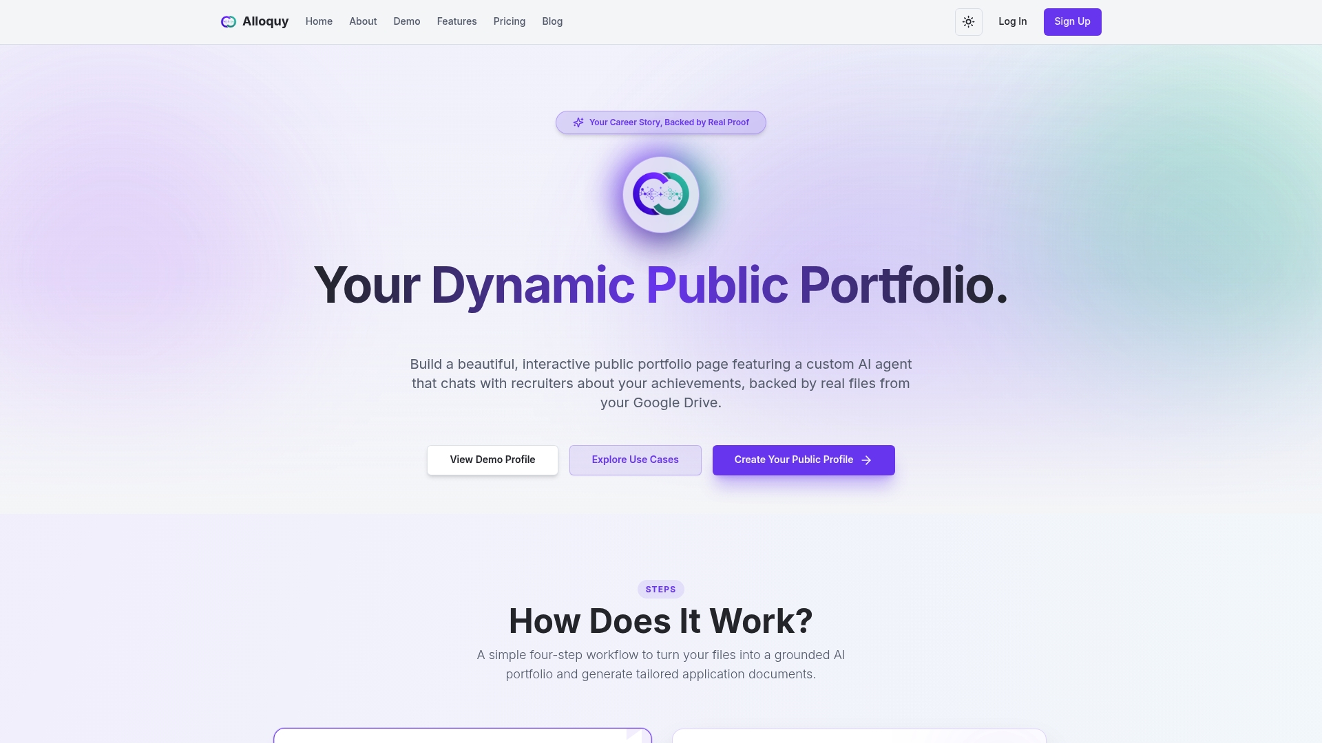
Alloquy maps directly to the build steps in this guide: seed templates for fast setup, evidence panels for the four-field case-study format, and recruiter-accessible AI chat that turns your portfolio into a live Q&A asset. Customizable themes keep your personal branding intact. The free tier is available immediately; expanded evidence storage, AI generation limits, and advanced branding options are available on paid plans.
View Alloquy’s pricing to compare tiers, or start building your profile on the free plan today.
Sources
- How to Build an Award-Winning Portfolio Site
- Freelancer website that converts
- Design portfolio examples — Webflow blog
- Taap
FAQ
What is a one-page portfolio?
A one-page portfolio is a focused, single-scroll website that presents your identity, selected work, and a primary call to action without requiring navigation to separate pages. It functions as a concentrated marketing asset designed to move a visitor from introduction to contact in one session.
How many projects should a one-page portfolio include?
Three to five projects is the standard recommendation, as research on freelancer conversion shows that more projects dilute positioning and reduce conversion rates. Each project should follow the Brief → Approach → Result → Tech format.
What should the first section of a portfolio page contain?
The hero section must answer three questions immediately: who you are, what you do, and who you help. It should contain your primary CTA and, where possible, one measurable result or short client attribution to establish credibility before the visitor scrolls.
How do you create a simple one-page portfolio quickly?
Start with your hero value statement and three project summaries written in plain text, then drop them into a no-code template (Webflow or Framer) or a static-site generator like Astro. A focused build following the sprint timeline in this guide can reach a publishable state in 10–14 days.
What makes a one-page portfolio website rank in search?
A clear H1 heading, logical section hierarchy, mobile-first layout, and load speed under 2.5 seconds are the primary ranking factors for a single-page format. Section-level schema markup and descriptive alt text on all images further support discoverability.