

The best portfolio About pages lead with who you help, what you deliver, and one clear next step, following structured onboarding and creative workflows that guide background and process presentation. Skip the résumé recap and skip the life story. Recruiters and clients scanning your page decide in seconds whether to keep reading, and The Muse notes that an effective About Me page has to show who you are, what you do, and why a visitor should care, all at once.
The pages that convert follow a compact formula: who you help, what you deliver, then a proof snapshot, followed by a short note on how you work and a single dominant call to action. A page cluttered with three or four competing CTAs confuses the visitor about what to do next, so cap it at two priority actions, max.
Three examples worth studying immediately:
- Mike Matas (Mikematas) pairs a blunt one-line role statement with visual work that does the talking.
- Perry Wang (Perryw-2023) gives developers a model for framing ownership and technical context briefly.
- Bradley Ziffer (Bradleyziffer) shows how a photographer can lead with a gallery and still close with one clean booking CTA.
Pro Tip: Read your About page out loud. If the first two sentences are about your history rather than the visitor’s problem, move them down or cut them.
Key Takeaways
An effective portfolio About page states who you help, what you deliver, and one clear next step, backed by a specific proof snapshot rather than generic claims.
| Point | Details |
|---|---|
| Lead with the client’s need | Open with who you help and what you deliver before any biography. |
| Cap your CTAs at two | More than two competing calls to action confuses visitors about what to do next. |
| Use specific proof, not superlatives | Replace “award-winning” with one concrete result or self-initiated sample. |
| Check accessibility and mobile layout | Confirm contrast ratios, alt text, and keyboard navigation work on a phone-first basis. |
| Verify claims with Alloquy | Alloquy turns linked Google Drive evidence into recruiter-accessible, verified proof behind your About page claims. |
Table of Contents
- Portfolio About Page Examples Worth Copying From
- What Should a Portfolio About Page Include?
- Three Ready-to-Use About Page Templates
- What Makes a CTA and Inquiry Form Actually Work?
- Where to Host Your Portfolio and When to Update It
- Accessibility Considerations for About Pages
- Common Mistakes That Sink Portfolio About Pages
- Showing Personality Without Losing Credibility
- What Makes an About Page Memorable
- How Alloquy Turns Your About Page Into Verified Proof
- Sources
- FAQ
Portfolio About Page Examples Worth Copying From
Curated roundups that pair visual examples with short, actionable notes remain one of the most effective ways to study About pages, according to Figma’s portfolio inspiration guide. The eight examples below span design, development, and photography, and each one demonstrates a specific pattern you can lift for your own page.
Mike Matas (multidisciplinary designer, mikematas.com) opens with a single declarative sentence about what he builds, then lets a scroll of shipped products carry the proof. There’s no biography paragraph competing for attention.

Spencer Gabor (spencergabor.work) pairs a clear role statement with strong visual samples right at the top of the page, so the copy and the work reinforce each other instead of sitting in separate sections.
Perry Wang (perryw-2023.webflow.io) writes for a technical audience: brief project context, explicit ownership notes (“I led,” “I built”), and none of the vague team-credit language that makes developer portfolios hard to evaluate.
Pierrick Calvez, Christina Kosik, James Williams, Artemii Lebedev, and Jose Ocando round out the set as recognizable names in design and product circles whose personal sites are frequently cited as reference points for concise, work-forward About sections rather than long personal essays.
Bradley Ziffer (bradleyziffer.com) uses a compact headline-plus-gallery layout, a small proof snapshot near the top, and a single primary CTA aimed at bookings, which fits the buying pattern for visual clients who decide fast.
| Example | Role | What to copy |
|---|---|---|
| Mike Matas | Multidisciplinary designer | One-line role statement, work-first layout |
| Spencer Gabor | Designer | Role statement paired directly with visual proof |
| Perry Wang | Developer | Explicit ownership language on technical projects |
| Bradley Ziffer | Photographer | Headline-plus-gallery with a single booking CTA |
Each of these treats the About page as a work sample in itself, not a separate biography tacked onto the portfolio.
What Should a Portfolio About Page Include?
An About page needs five structural pieces in order: a headline naming who you help, a short proof snapshot, a line on how you work, a boundary or fit statement, and one dominant CTA. That order matters more than the exact wording, because visitors scan top to bottom and decide within the first two lines whether to keep reading.
Structure checklist:
- Headline stating who you help and what you deliver (not your job title alone).
- A proof snapshot: one concrete result, one role, one outcome.
- A short paragraph on your process or working style.
- A boundaries or fit line (project size, timeline, communication style).
- One primary CTA, with a secondary one only if it’s genuinely different (e.g., “hire me” plus “view resume”).
Design checklist:
- Use a current, well-lit headshot or a work-in-context photo, not a stock image.
- Establish visual hierarchy so the headline is the largest text on the page, followed by the proof snapshot.
- Body text should sit at 16px or larger with contrast ratios that meet WCAG AA (4.5:1 for normal text).
- Test the layout at 375px width first. Most visitors will land on mobile before they ever see the desktop version.
On copy, the biggest failure pattern is writing an About page that’s purely biographical. High-performing pages pivot to the client’s actual need within the first two paragraphs, according to Monster’s guidance on professional bios, which also warns against generic superlatives like “award-winning” or “world-class” without a specific example backing them up. Authenticity and a humble, specific professional history persuade sophisticated clients more reliably than inflated claims.
That doesn’t mean stripping out personality entirely. The Muse frames personal details as seasoning, not the main course: one line about a hobby or an unusual career pivot can build rapport, but it should never displace the proof and process content that actually gets you hired.
For your CTA, ask for exactly what you need to qualify a lead: project scope, rough timeline, and budget range. A three-field inquiry form outperforms a bare “Contact me” link because it filters out mismatched inquiries before they hit your inbox.
Pro Tip: Add one microcopy line under your contact button, like “I typically respond within 2 business days and take on 2 to 3 new projects per quarter.” It quietly pre-qualifies visitors by setting expectations before they even reach out.
If you work in engineering or product, the structural principles carry over directly. Alloquy’s guide on avoiding common portfolio pitfalls for senior engineers covers how to sequence background, expertise, and approach without burying the reader in credentials.
Three Ready-to-Use About Page Templates
Below are three role-specific templates you can paste directly into a draft and adjust to your own voice. Each follows the same five-part structure: headline, proof snapshot, working style, boundary/fit, and CTA.
1. Designer template
Headline: “I help early-stage startups turn rough ideas into products people trust.” Proof snapshot: “Most recently, I redesigned the onboarding flow for a fintech app, cutting drop-off by a meaningful margin in the first release.” Working style: “I work in short sprints with weekly check-ins, and I share work-in-progress early rather than disappearing for weeks.” Boundary/fit: “I take on 2 to 3 projects per quarter and work best with teams that have a clear product owner.” CTA microcopy: “Tell me about your project — scope, timeline, and budget — and I’ll reply within 2 business days.”
2. Developer template
Headline: “I build backend systems for companies that can’t afford downtime.” Proof snapshot: “I led the migration of a legacy billing system serving thousands of daily transactions, with zero data loss during cutover.” Working style: “I document as I build and hand off clean, tested code, not a black box.” Boundary/fit: “I’m best suited to teams that already have a defined technical spec or want help writing one.” CTA microcopy: “Send me your project brief or repo link, and I’ll tell you honestly whether I’m the right fit.”
3. Photographer template
Headline: “I shoot brand and product photography for teams that need images that actually convert.” Proof snapshot: “My work has appeared in campaign launches for consumer brands across two continents.” Working style: “I run a one-day shoot-to-delivery process for most product sessions, with revisions built into the quote.” Boundary/fit: “I book 4 to 6 weeks out and specialize in studio and on-location product work.” CTA microcopy: “Check available dates and get a quote in under 24 hours.”
Keep social-platform bios to one or two sentences and save the full five-part structure for your portfolio’s About page. Freelance bio guidance recommends this shorter-for-social, longer-for-portfolio split so your LinkedIn summary and your website don’t read like duplicate copy. Adapt the wording to your actual voice, but keep every template client-focused: the proof snapshot and boundary line should never get cut for the sake of sounding more personal.
What Makes a CTA and Inquiry Form Actually Work?
A clear call to action isn’t optional on a portfolio About page. It should tell the visitor exactly what to do next, and limiting yourself to two priority CTAs at most keeps the page from feeling scattered. “Book a call,” “request a quote,” or “view my resume” all work, but pick two and commit.
CTA and inquiry checklist:
- State the expected response time (“I reply within 2 business days”) so visitors know what to expect.
- Required inquiry fields: project type, timeline, budget range.
- Optional fields: company name, referral source, preferred communication channel.
- Limit the form to five fields max. Long forms lose leads before submission.
For evidence, one specific work sample beats three vague mentions. If you lack client-approved examples, The Muse suggests building short self-initiated samples that mirror the projects you want to win. A self-directed case study, clearly labeled as such, still counts as verifiable proof as long as it’s specific.
Pro Tip: Whatever your About page promises about revisions, response time, or process, make sure your actual contract matches it word for word. A mismatch between your page and your paperwork is the fastest way to lose trust after the first inquiry.
Where to Host Your Portfolio and When to Update It
A custom domain paired with a static site gives you full design control and no per-visitor cost, but you’re responsible for hosting, security patches, and layout maintenance yourself. Hosted portfolio platforms trade some of that control for built-in templates, automatic updates, and faster setup, which suits creatives who’d rather spend time on client work than site maintenance.
Update timeline:
- Quarterly: re-check your proof snapshot and swap in your most recent strong project.
- After every major project: add or replace an example before the memory fades.
- On any role or offer change: update your headline immediately. A stale headline is the fastest way to misqualify leads.
- Every update: recheck mobile layout and confirm your CTA button still works and hasn’t been buried by new content.
Alloquy’s overview of the modern career tech stack covers how portfolio platforms fit alongside resume tools and LinkedIn in a professional’s broader toolkit.
Accessibility Considerations for About Pages
An About page that only works for sighted, mouse-using visitors quietly excludes a meaningful share of your audience, including recruiters using screen readers or keyboard navigation. Accessibility isn’t a separate checklist item bolted onto design. It’s part of whether your page functions at all for some visitors.
Start with color contrast: body text against its background should meet a 4.5:1 ratio at minimum, and your CTA button needs enough contrast to stand out without relying on color alone (add an icon or underline for colorblind visitors). Every image, especially your headshot and portfolio thumbnails, needs descriptive alt text rather than a filename dump like “IMG_2041.jpg.”
Structure your headings logically. Your headline should be a genuine H1, followed by H2s for each section, so screen reader users can jump between sections instead of listening to the entire page linearly. Avoid embedding critical information, like your CTA or contact details, inside an image or a video with no text equivalent.
Keyboard navigation matters as much as visual design. Tab through your own page: if you can’t reach your contact form or CTA button without a mouse, a portion of your visitors can’t either. Video introductions, increasingly common on About pages, need captions, since not every visitor will or can turn on audio.
None of this requires a redesign. Most fixes are text and markup adjustments you can make in an afternoon, and they widen who can actually engage with your work.
Common Mistakes That Sink Portfolio About Pages
The most frequent failure is leading with biography instead of the client’s problem. A page that opens “I’ve always loved design since I was a kid” forces the visitor to keep reading just to find out what you actually do, and most won’t bother.
Piling on unverified superlatives is the second-biggest mistake. “Award-winning,” “world-class,” and “best-in-class” mean nothing without a specific example attached, and sophisticated clients notice the gap immediately.
Too many competing CTAs is a subtler problem. A page with a “Hire Me” button, a newsletter signup, a “Buy My Course” banner, and a social follow prompt gives the visitor four reasons to do nothing. Pick your two priorities and remove the rest.
Other recurring mistakes worth flagging:
- Stale portfolio pieces. Showing work from three years ago as your lead example signals you haven’t done anything notable recently.
- No process information. Clients want to know how you work, not just what you’ve made.
- Missing boundaries. Without a fit statement, you’ll field inquiries for work you don’t actually want.
- Ignoring mobile layout. A About page that looks polished on desktop but breaks on a phone loses the majority of casual visitors.
- Confidential project details exposed. Naming a client or sharing internal metrics without permission can cost you the relationship even if the page looks great.
Showing Personality Without Losing Credibility
Personality earns trust, but only when it’s specific and brief. A single sentence about an unusual career pivot, a hobby that shaped your working style, or a small quirk in how you approach projects can make a page memorable. Three paragraphs about your personal life will bury the proof points a client actually came to find.
The trick is placement. Put the personal detail after the proof snapshot and process section, never before it. A visitor who’s already convinced you can do the work is far more receptive to a personal aside than one who’s still deciding whether to keep reading. One practitioner writeup on structuring About sections makes the case that honesty and personality can be a genuine advantage, but only when matched to the audience reading the page.
Voice matters more than content here. Writing the way you’d actually talk to a client on a discovery call, rather than the way a press release would describe you, does more for authenticity than any specific personal fact. If your written bio sounds nothing like you sound on a call, a client will notice the disconnect the moment you speak.
Photos help too. A photo of you actually working, presenting, or on-site with a past project tells a more credible story than a studio headshot alone, and it doubles as subtle proof that the work in your portfolio is real.

What Makes an About Page Memorable
The About pages that stick with me are the ones that read like a person actually wrote them for a specific kind of client, not a template filled in after the fact. That distinction shows up in small choices: a proof snapshot that names a real constraint instead of a vague outcome, a boundary line that turns away the wrong-fit inquiries instead of chasing every lead.
What most people miss is that the CTA is where pages fail quietest. A page can nail the headline and the proof section and still lose the visitor at the very last step because the next action is unclear or buried under three competing buttons.
Before publishing, test your copy on someone outside your field. If a friend who has no idea what you do can explain back to you who you help and what to do next, the page works. If they can’t, the wording needs another pass, regardless of how polished the visuals look.
How Alloquy Turns Your About Page Into Verified Proof
Most of the guidance above depends on one thing: having real proof to back your claims without exposing confidential client work. That’s the exact gap Alloquy was built to close. Instead of a static About page that just asserts what you did, Alloquy lets you link Google Drive documents to build interactive case studies, so a recruiter or client can ask your AI assistant follow-up questions and get verified, contextual answers instead of taking your word for it.
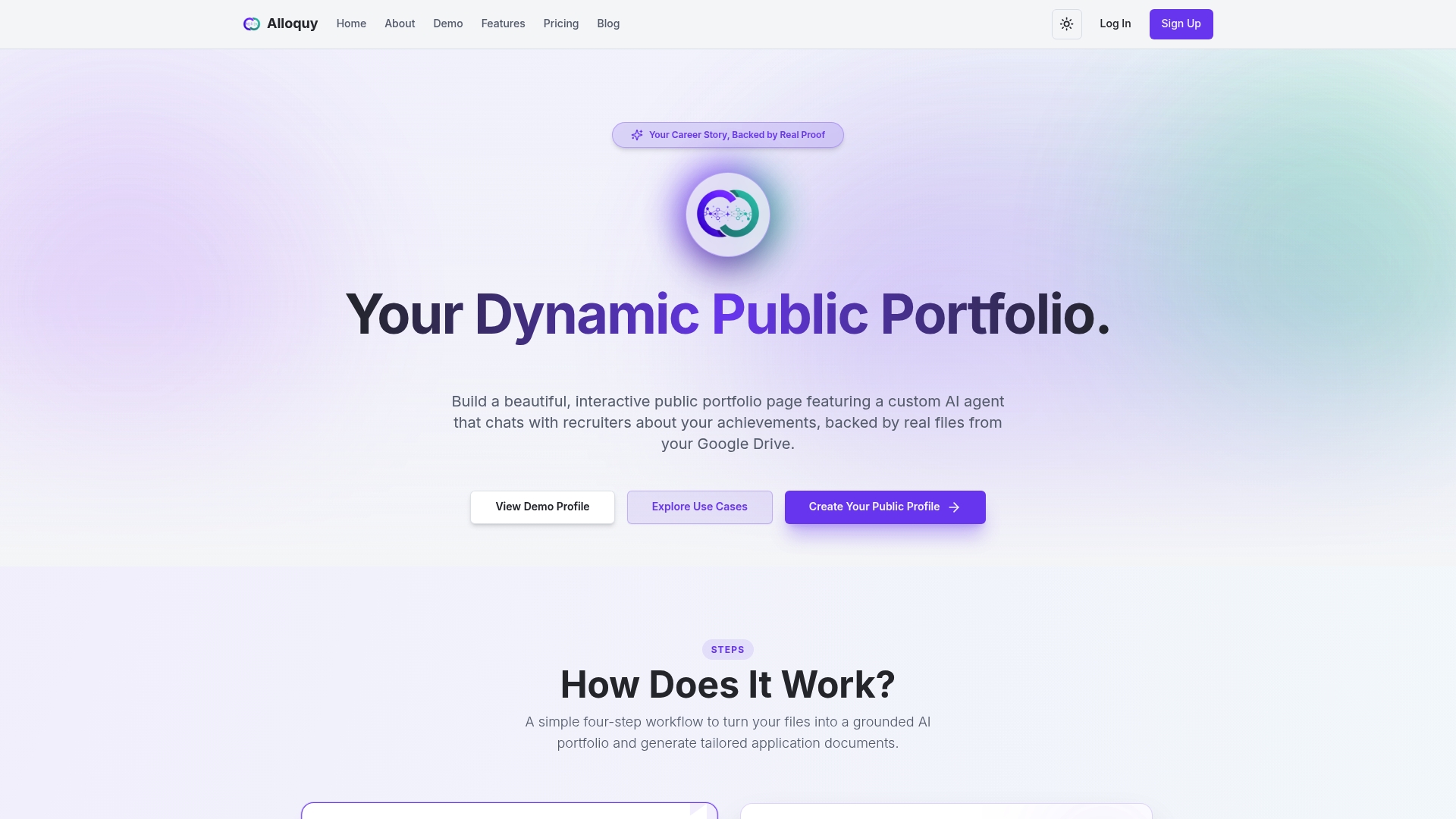
This solves the confidentiality problem directly. Alloquy’s approach to showcasing work without compromising privacy means you can demonstrate impact from sensitive projects without naming clients or exposing internal data. The platform also lets you configure a single, clear CTA and generate tailored resumes and cover letters from the same verified evidence, so your page promises and your actual application materials stay consistent. Whatever process or response time you state on your page, make sure it matches what happens after someone actually reaches out.
If your current About page is making claims your portfolio can’t back up in real time, check the Alloquy pricing page to see which plan fits how much evidence you need to showcase.
Sources
- How to write an effective “About Me” page (The Muse)
- Gruv
- 23 Inspiring Portfolio Website Examples & Tips
FAQ
What Are Some Good Examples of Portfolio About Pages?
Mike Matas, Spencer Gabor, Perry Wang, and Bradley Ziffer each demonstrate a different strong pattern, from work-first design layouts to developer-focused ownership language and photographer booking CTAs.
What Is a Portfolio About Page?
It’s the section of your portfolio that states who you help, what you deliver, and how to work with you, built around a proof snapshot rather than a general biography.
How Do I Create a Portfolio About Page?
Start with a headline naming who you help, add one specific proof snapshot, describe your working style briefly, state your project fit, and close with a single primary CTA.
How Do I Write a Strong Portfolio About Page Example?
Write for the client’s decision, not your life story: lead with the problem you solve, back it with one verifiable result, and avoid generic superlatives without evidence behind them.
How Can I Prove My Work Without Sharing Confidential Client Details?
Tools like Alloquy let you link supporting documents privately so a recruiter’s AI assistant can verify project impact through Q&A without exposing sensitive client information on the public page.
Recommended
- Proof Without Exposure: Showcase Your Work Without Compromising Privacy or Credibility | Alloquy Blog | Alloquy
- Why Multi-Format Resume Assets Are Key to Modern Job Search Success | Alloquy Blog | Alloquy
- 5 Critical Pitfalls Senior Engineers Must Avoid on Technical Portfolios | Alloquy Blog | Alloquy
- Executive Career Portfolios: How VP & C-Suite Candidates Win Global Roles | Alloquy Blog | Alloquy