
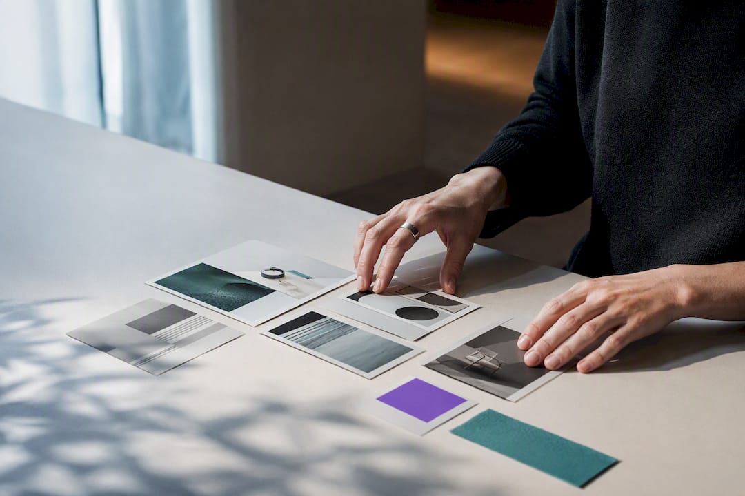
The fastest way to make any portfolio look branded and hireable is a repeatable system: one style guide covering type, color, and image treatment, applied across 2 to 4 tightly built case studies. Skip decorative variety in favor of that consistency, layer in accessible contrast and restrained motion, and the portfolio starts reading as a coherent professional identity rather than a folder of projects. The sections below break down 12 concrete branding ideas, a minimum viable style guide, a case study template built to convert, and a QA checklist to run before anything goes live.
TL;DR:
- A minimal style guide with one primary color, two supporting colors, and two typefaces is essential before designing case studies to ensure consistency.
- Locking thumbnail aspect ratios, caption tone, and export settings helps prevent style drift across projects and preserves brand coherence.
- Case studies should start with outcomes, use a clear structure with concise text, and be paired with strong visuals to maximize engagement and effectiveness.
- Accessibility rules like high contrast and reduced motion must be enforced through regular checks to maintain usability and brand integrity.
- Integrating interactive profiles that connect to verifiable evidence, such as linked documents and AI assistants, can significantly increase credibility and recruiter engagement.
Table of Contents
- Portfolio Branding Ideas Worth Stealing in 2026
- Build a Minimum Viable Style Guide Before You Design Anything
- The Case Study Layout Structure That Actually Converts
- Accessibility and Motion Rules That Protect Your Brand
- Pre-Publish QA Checklist and Performance Guardrails
- An Alloquy Perspective on Evidence-Backed Portfolio Branding
- Strategies for Storytelling Through Portfolio Branding
- Tips for Targeting Specific Audiences With Portfolio Branding
- Integration of Digital and Print Portfolio Branding
- Examples of Successful Portfolio Branding Ideas and Analysis
- What Actually Moves the Needle on Portfolio Branding
- Make Your Branded Portfolio Interactive With Alloquy
- Sources
- FAQ
Portfolio Branding Ideas Worth Stealing in 2026
Portfolio trends for 2026 favor interactive, systemized presentation over decorative flourish, which means every idea below earns its place only if it reinforces consistency rather than adding visual noise. Here are 12 that do.
- Color-dominant themes with palette rules. Pick one saturated brand color, pair it with a neutral and one accent, then apply that trio everywhere, from buttons to case study headers. Color drenching photographs well in screenshots and reads instantly on a crowded job board.
- Hero-to-outcome landing. State what you do and the result you drive in one sentence above the fold, backed by a curated thumbnail grid. Visitors decide whether to stay within seconds, so the hero has to carry real information, not a tagline.
- Consistent thumbnail aspect ratio. Lock every project thumbnail to the same ratio and crop treatment so the homepage grid feels engineered rather than assembled.
- Dark mode with accessible contrast. Near-black palettes photograph beautifully for visual and motion work, provided text and icons still clear contrast minimums.
- A minimalist type system. One display typeface, one body typeface, and fixed sizes for headings, subheads, and captions. Two fonts, used with discipline, look more expensive than five used loosely.
- Branded PDF leave-behinds. A downloadable case study PDF with your logo, palette, and type system reinforces identity long after the browser tab closes.
- Microcopy that matches your positioning. A button that says “See the build process” reads differently than one that says “View project,” and both should match how you’d describe yourself in an interview.
- A hybrid site-plus-platform approach. Pairing a personal site with a platform hub increases discoverability without diluting your visual identity, provided both point back to the same brand system.
- Subtle motion with reduced-motion fallbacks. A soft hover state or scroll reveal adds polish, but only if it degrades gracefully for visitors who have motion sensitivity turned on.
- QR-code business cards linking to evidence. A physical card that opens directly onto a case study, or an interactive AI-assisted profile, turns a networking moment into a demonstrable one.
- Tactile texture overlays. A subtle grain or paper texture adds depth to an otherwise flat digital layout, as long as file sizes stay light enough to protect load speed.
- Curated social preview templates. Set a fixed layout for how your projects appear when shared on LinkedIn or Twitter, so the visual identity survives outside your own site.
Pick 3 or 4 of these rather than all 12. The studios that build distinctive portfolio brands tend to succeed by restraint, not accumulation. For more direction on visual identity ideas that fit specific creative disciplines, a style gallery worth borrowing from can narrow the decision faster than starting from a blank page.
Build a Minimum Viable Style Guide Before You Design Anything
A small set of non-negotiables creates recognition faster than adding more decorative treatments, and you can document all of it on a single page. Lock in these seven items before you touch layout:
- Your one-line positioning and the type of client or role you’re targeting.
- Logo or wordmark usage rules, including minimum safe spacing around it.
- One primary color plus two support colors, each with a defined role (accent, neutral, background).
- One heading typeface and one body typeface, with exact sizes and weights specified for headings, subheads, and captions.
- Thumbnail aspect ratio, crop rules, and a chosen image treatment (duotone, film-style crop, or device mockup).
- Caption tone, CTA phrasing, and export settings for any PDF version of your work.
- A recurring 10-minute QA pass, run monthly, to catch style drift before it spreads across new projects.
That last point matters more than it sounds. Practitioners often reuse a layout skeleton for a new project but skip re-checking the underlying system decisions, a failure mode sometimes called template drift, where three projects in, the fonts have quietly shifted and the color palette has crept.
Pro Tip: Write your style guide as if you were handing it to a freelancer who has never seen your work. If they couldn’t recreate your thumbnail treatment from your notes, the guide isn’t finished yet.
The Case Study Layout Structure That Actually Converts
Case studies convert better when they lead with outcomes and keep body copy tight, and the layout below reflects that discipline in five parts.
- Header block. Project name, one-sentence description, client name or tags, and a hero image that communicates the work at a glance.
- Outcomes, immediately. Two to four results, displayed prominently, whether that’s a measurable number or a concise qualitative win like “reduced onboarding confusion for new users.”
- Curated image set. Five to eight images, each with a short caption stating what it shows and the decision behind it, not a generic label.
- Narrative, 150 to 400 words. Focus on decisions and trade-offs you made, not a day-by-day process diary.
- Closing CTA and navigation. A link to another case study keeps hiring managers moving through your work instead of bouncing after one project.
Case studies built this way tend to stay under 500 words with 5 to 8 images total, which is tighter than most designers expect. Bold key phrases for scanners, keep no paragraph longer than four sentences, and give headings that actually carry meaning (“Cut checkout drop-off by simplifying form logic” beats “Process”). For a fuller breakdown of this structure with worked examples, Alloquy’s case study framework for designers walks through the same template in more depth.
Accessibility and Motion Rules That Protect Your Brand
Branding choices that ignore accessibility eventually break usability, and two WCAG provisions matter most for portfolios.
- Non-text contrast. WCAG’s 1.4.11 criterion requires icons, buttons, and other meaningful graphical elements to hit at least a 3:1 contrast ratio against adjacent colors, a rule that trips up dark mode themes and outline icons more often than solid text.
- Reduced motion. Honor the visitor’s system preference with the
prefers-reduced-motionmedia query, so scroll animations and hover effects degrade gracefully for anyone who has that setting enabled.
Run four checks before launch: a contrast checker on every icon and button, a keyboard-only pass through your navigation, a reduced-motion device test, and a quick load-time sample on your heaviest case study page.
Pre-Publish QA Checklist and Performance Guardrails
Run this sequence before any portfolio update goes live.
- Confirm thumbnail ratios match across every project, alt text is present on all images, and captions stay concise.
- Compress images and enable lazy loading; keep each case study page under roughly 2.5MB total.
- Recheck color contrast and confirm reduced-motion behavior on at least one animated element.
- Write a unique meta title and description for each case study, and confirm every page uses one consistent H1 pattern.
Pro Tip: Keep a simple spreadsheet with one row per case study and columns for “last QA date” and “issues found.” A five-minute monthly glance catches drift long before a recruiter does.
An Alloquy Perspective on Evidence-Backed Portfolio Branding
Visual branding gets a recruiter’s attention; it doesn’t prove the work happened. Interactive profiles can let a custom AI assistant answer recruiter questions using linked documents, so a branded case study may point to evidence behind its stated outcomes rather than asking the reader to take claims on faith.
Strategies for Storytelling Through Portfolio Branding
Every case study is a story with a protagonist, a problem, and a resolution, and your branding decisions should reinforce which part of that story you want remembered. If your positioning is “I solve messy data problems,” your imagery, captions, and even your color choices should lean structured and calm rather than playful and loose. Mismatched tone confuses hiring managers faster than weak visuals do.
Sequence your case studies deliberately instead of listing them chronologically. Open with your strongest outcome, not your most recent project, since most visitors never scroll past the first two entries. Use captions to narrate a decision, not describe an image: “Simplified the navigation from 7 items to 4 after usability testing” tells a story; “Homepage navigation” does not.
Consistency in voice matters as much as consistency in color. If your about page reads casual and your case studies read clinical, the portfolio feels like two different people wrote it. Pick a register (direct and confident works well for most creative fields) and hold it across every microcopy decision, from button labels to error states in an embedded prototype.
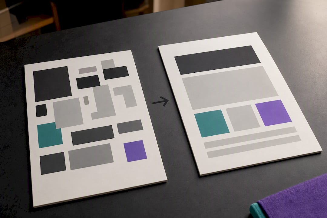
Finally, let contrast do narrative work. A “before” screenshot next to an “after” result is one of the oldest storytelling devices in design, and it still outperforms a paragraph explaining the same improvement. Branding isn’t just how your portfolio looks; it’s the throughline that makes a stranger trust the story you’re telling about your own work.
Tips for Targeting Specific Audiences With Portfolio Branding
A portfolio built for a scrappy startup recruiter should not look identical to one built for a enterprise design lead, even if the underlying work overlaps. Startups tend to respond to speed and scrappiness signals: show iteration, show a fast timeline, and let your voice sound a little more informal.
Enterprise and agency audiences usually want evidence of process discipline and cross-functional collaboration. Lean into case studies that mention stakeholder alignment, design systems work, or measurable business outcomes, and keep your visual tone more restrained.
If you’re targeting multiple audience types at once, consider a filterable homepage rather than diluting your positioning into something vague enough to fit everyone. A single tagline like “Product designer focused on fintech onboarding” filters harder, and better, than “Creative problem solver,” even though the second one feels safer to write.
Freelancers pitching directly to founders benefit from a different emphasis than designers applying to in-house roles: founders respond to business impact framed in plain language, while in-house hiring managers often want to see how you operate inside a team. Adjust the case study narrative’s focus, not the underlying brand system, to serve each audience without rebuilding your whole site twice.
Integration of Digital and Print Portfolio Branding
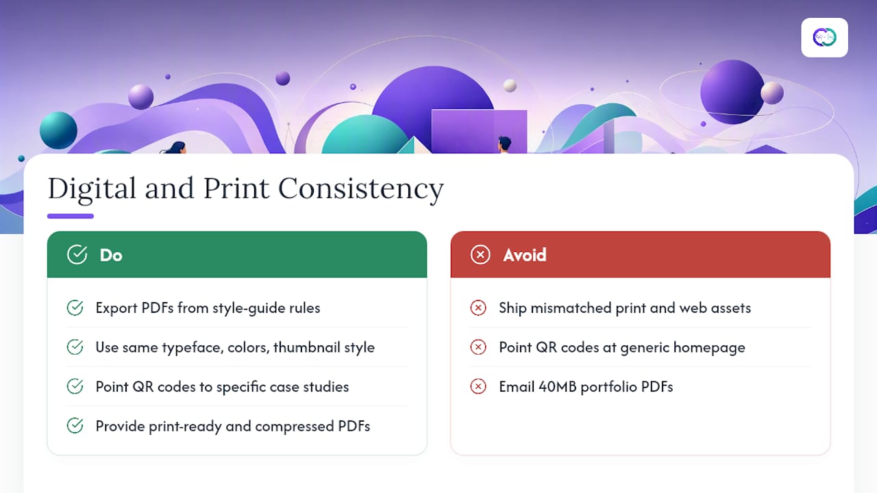
Digital and print rarely get equal attention, but a mismatch between them undercuts the very consistency your style guide is supposed to protect. If you hand someone a printed leaf-behind or a branded PDF case study, it needs the same type system, color roles, and caption tone as your live site, not a simplified afterthought.
Export your PDF case studies directly from your style guide rules: same heading typeface, same primary and support colors, same thumbnail crop style. A recruiter who opens your PDF after browsing your site should feel no seam between the two.
Print also imposes constraints that sharpen digital thinking. A business card only has room for a logo, a name, a role, and a QR code, which forces you to decide what one detail matters most. That same discipline, applied back to your digital homepage, often improves it. If you’re using QR codes on cards or printed materials, point them at a specific case study or an interactive profile, not your generic homepage, so the physical handoff leads somewhere immediately useful.
Keep file formats practical: a print-ready PDF at high resolution for physical handoffs, and a compressed web version under a reasonable size limit for email attachments or downloads from your site. Nobody wants to email a 40MB portfolio PDF, and a bloated attachment undercuts the same performance discipline your website QA checklist is meant to enforce.
Examples of Successful Portfolio Branding Ideas and Analysis
A portfolio that commits to a single accent color across every case study thumbnail, button, and hover state reads as intentional within the first three seconds, even before a visitor reads a word of copy. That’s color drenching doing its job: one saturated hue used with total consistency signals more design maturity than five “tasteful” neutral tones spread across different pages.
Portfolios that pair a dark, near-black background with a single bright accent color tend to work particularly well for motion, illustration, and 3D specialists, since dark backgrounds make saturated work pop without competing for attention. The risk is contrast: several designers who adopt dark mode drop the visible contrast on body text or icon strokes below usable levels, which is exactly the failure the WCAG non-text contrast criterion exists to catch.
Hybrid setups, where a personal site handles brand identity and a platform profile handles discoverability, tend to outperform single-channel portfolios because they capture both direct visitors and recruiters searching platforms. The strongest examples keep the visual system (color, type, caption tone) identical across both, so a recruiter bouncing between the platform hub and the personal site never loses the thread of who they’re looking at.
What Actually Moves the Needle on Portfolio Branding
Most portfolio advice overweights visual novelty and underweights systemization. Designers chase a new layout trend or an ambitious motion effect when the honest gap in their portfolio is inconsistency between projects, not a lack of creativity. The research on this is consistent: a small set of locked decisions, two typefaces, one primary color, one thumbnail ratio, one caption tone, builds recognizable identity faster than adding another decorative flourish ever will.
The conventional advice to “make your portfolio stand out” is backwards for most job seekers. Standing out visually matters far less than being instantly legible: what you do, what results you drove, and whether the recruiter can verify any of it. That third piece is where most branding conversations stop short. A beautifully designed case study still asks the reader to trust a claim on faith.
Prioritize in this order: lock the style guide first, build 2 to 4 case studies against that system second, and only then experiment with motion or texture. Skipping straight to visual polish before the system exists is why so many portfolios feel disjointed by their fifth project.
— Alloquy Team
Make Your Branded Portfolio Interactive With Alloquy
A branded case study still leaves recruiters guessing whether your stated outcomes are accurate, since a PDF or static page can’t answer follow-up questions. Alloquy solves that gap by connecting your linked Google Drive documents to a custom AI assistant on your public profile, so recruiters can ask specific questions and get evidence-backed answers instead of taking your case study copy on faith.
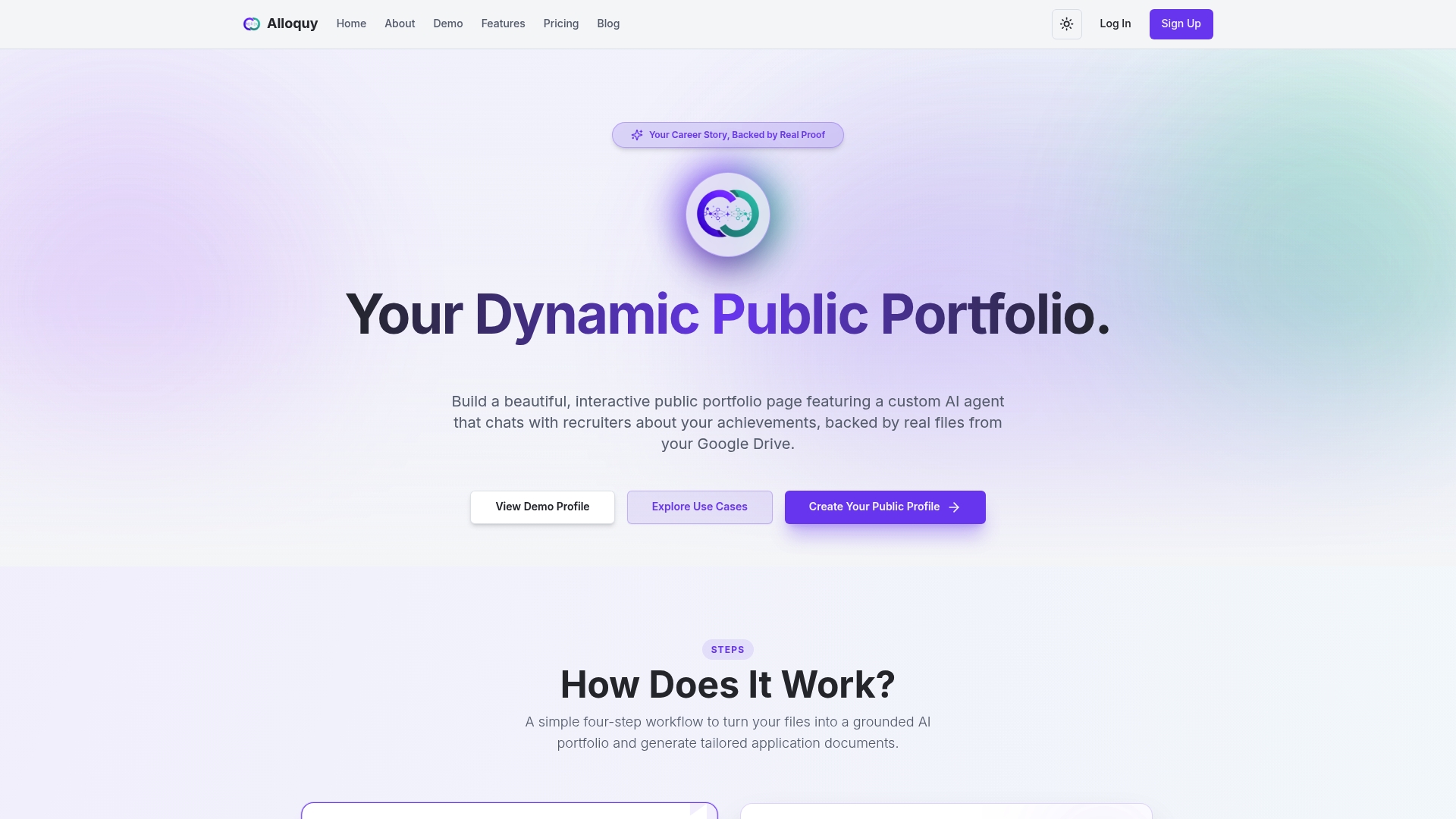
Customizable themes can keep your color palette, type choices, and voice consistent with the rest of your portfolio, while the platform handles the interactive layer and the generation of tailored resumes and cover letters from verified data. Start on the free tier to build your first evidence-backed profile, or check the pricing plans if you want expanded case study capacity and higher AI generation limits from the start.
Sources
- How to Build a Distinctive Brand That Elevates Your Creative Portfolio
- Case Study Layouts That Convert in 2026: A Studio Template You Can Reuse
- WAI technique C39: Using prefers-reduced-motion to respect reduced-motion preferences
- Portfolio design trends (2026)
FAQ
Can you give me an example of a brand portfolio?
A strong example locks one accent color, one type pairing, and one thumbnail ratio across every project, then reuses that system in PDFs and social previews so the identity holds up everywhere the work appears.
What should I avoid in a portfolio?
Avoid mixing more than two typefaces, inconsistent thumbnail crops, decorative animations with no reduced-motion fallback, and case studies that read as process diaries instead of leading with outcomes.
What are some good ideas for portfolio design?
Color-dominant themes, a minimalist type system, branded PDF case studies, and a hybrid site-plus-platform setup all rank among the most effective ideas for building a memorable, consistent identity.
What is the best portfolio design approach for 2026?
The strongest approach favors systemized, interactive presentation over decorative variety: a locked style guide, accessible motion, and case studies backed by verifiable evidence, which is the model Alloquy is built around.
Does Alloquy work with an existing portfolio brand?
Yes. Alloquy’s customizable themes are designed to carry over your existing color palette, typography, and voice while adding an interactive AI assistant that answers recruiter questions using your verified evidence.