
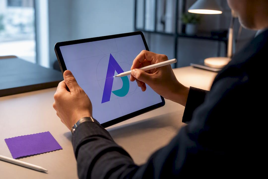
For most people building a professional identity, a well-crafted wordmark, your name set in a distinctive typeface, does the job better than an abstract mark ever will, because the name itself is the primary recognition asset. The main exceptions are speakers, authors, and creators selling productized offers or merchandise, where a compact symbol earns its keep. Everything else comes down to five decisions: type, color, a small-space version, correct exports, and a short set of rules you actually follow.
TL;DR:
- Most professionals should focus on a consistent wordmark, a strong headshot, and one color rather than investing in a symbol unless selling merchandise or running a separate product brand.
- Choose a wordmark, monogram, or symbol based on space needs, with a default to a wordmark and adding a monogram for small icons or avatars.
- Use a single bold color paired with a neutral and ensure the typeface matches your communication style; avoid complex palettes or unnecessary effects.
- Build a logo kit including an SVG master, PNG avatars, favicon, and usage rules to maintain consistency and prevent degradation of your visual identity.
- Patience is key; avoid redesigning within the first year to build recognition, and back your logo with a verified portfolio and evidence of your work.
Table of Contents
- Do You Need a Personal Logo, or Just a Wordmark?
- What Type of Personal Logo Fits Your Situation?
- Color, Typography, and Small-Space Rules That Hold Up
- What Tools Actually Get You From Idea to Export?
- How Do You Adapt Inspiration Without Copying a Cliché?
- Building Your Logo Kit and the Three Rules You Won’t Break
- How a Verified Portfolio Reinforces Your Logo
- Why Patience Beats Perfectionism on Logo Design
- Pair Your Logo With Proof That Backs It Up
- Sources
- FAQ
Do You Need a Personal Logo, or Just a Wordmark?
Most professionals don’t need a symbol at all. A consistent name treatment, a good headshot, and one repeated color often carry more weight than a designed mark, because personal brand recognition depends on consistency across touchpoints rather than on a clever icon.
A dedicated logo earns its cost in specific situations:
- You sell a productized service or course under a distinct name (not just your own).
- You produce merchandise, stickers, or physical goods that need a compact mark.
- You’re a speaker or media personality who appears on slides, step-and-repeat banners, or thumbnails.
- You run a personal brand separate from your legal name (a stage name, a pen name, a studio brand).
If none of that applies, skip the symbol. Spend your time on a clean wordmark, a strong headshot, and one color instead. DIY execution in an afternoon beats a freelancer project that drags out for weeks when the underlying need is this simple.
What Type of Personal Logo Fits Your Situation?
Three formats cover almost every case, and each solves a different problem.
- Wordmark. Your name set in a distinctive typeface, nothing else. It’s the default choice because your name is what people already search for, say out loud, and type into email signatures.
- Monogram. Your initials compressed into a small icon. It solves the problem a wordmark can’t: fitting into a 32-pixel favicon or a circular social avatar where full-name text turns to mush.
- Symbol. An abstract or literal icon detached from your name entirely. It only makes sense once you’re building a product, course, or merch line that needs to stand on its own.
The decision rule is straightforward: default to a wordmark, add a monogram as a companion mark for small spaces, and reserve a full symbol for a genuine productized brand. This choice also shapes your avatar strategy. If your headshot already anchors your social profiles, a monogram can live quietly in the corner of graphics and slides, while your face and name do the actual recognition work everywhere else.
Color, Typography, and Small-Space Rules That Hold Up
Design decisions for a personal logo are simpler than corporate branding because you’re optimizing for one thing: instant recognition at small sizes, repeated hundreds of times.
Statistic to build around: a single distinct color paired with one neutral outperforms multicolor palettes for individual brands, because repetition at personal scale is too infrequent to teach viewers a complex palette.
- Pick one bold color and one neutral (black, white, or a warm gray). Test the bold color against your actual headshot and inside a thumbnail-sized crop before committing.
- Choose a typeface family with at least three weights (light, regular, bold) so you have flexibility for headers versus body text without switching fonts.
- Match the typeface’s personality to how you actually communicate. A geometric sans reads modern and direct; a serif reads established and editorial.
- Adjust letter spacing (kerning) by eye until your name doesn’t look cramped or oddly gapped at small sizes. Resist the urge to add strokes, shadows, or gradients.
- Build a simplified small-space version early, often just your initials, since a full wordmark disappears at favicon size.
Before calling it done, prepare these exports: an SVG master file (infinitely scalable, edit-friendly), PNG avatars in the sizes your platforms require, and a favicon derived from the same simplified mark rather than a shrunk version of the full logo.
What Tools Actually Get You From Idea to Export?
You don’t need a design degree to finish this in a weekend. DIY production of a wordmark is entirely achievable in Figma or Canva; a freelancer adds polish, but the underlying system and usage rules matter more than paying for an expensive custom mark.
- Moodboard first. Collect five or six logos you admire in your field for fifteen minutes, and note what they share: a typeface style, a color family, a layout habit.
- Rough mockups. Try three or four quick variations of your name in different typefaces before committing to one direction.
- Refine the winner. Adjust spacing, weight, and color until it holds up at both full size and thumbnail size.
- Export everything. Save your source file, an SVG master, PNG sizes for each platform, hex/RGB color codes, and your font files or licensing info.
Figma gives you the most control over kerning and export precision. Canva is faster if you want templates and don’t need pixel-level tweaking. AI-assisted tools and AI-driven brand workflows are worth a quick pass for ideation, generating typeface and layout combinations you wouldn’t have considered, before you refine manually.
Pro Tip: Build your handoff kit even if you’re never hiring a designer. Future-you, updating a header graphic at midnight before a launch, will be grateful for a folder with every size and color code already labeled.
How Do You Adapt Inspiration Without Copying a Cliché?
Looking at other personal logos is useful only if you understand why each one works for that specific person, not just that it looks good.
A consultant’s wordmark in a clean serif signals credibility and experience, the kind of visual restraint that reads as “I don’t need to shout.” A compact profile, someone juggling five platforms with limited real estate, benefits from a monogram that survives at 40 pixels. A productized creator selling a course or a physical product needs a symbol that can live on packaging and merch independent of their name.
- Avoid the generic geometric-swoosh cliché that shows up in every logo-maker template.
- Pick one typographic or color detail that’s genuinely yours, an unusual letter treatment, an unexpected but tasteful color, rather than a stock icon.
- Test every serious candidate as a developer portfolio header, a LinkedIn avatar, a slide deck logo, and a favicon before finalizing anything.
If it survives all four contexts without turning illegible or generic, you’ve found your mark.
Building Your Logo Kit and the Three Rules You Won’t Break

A logo without usage rules degrades fast, one collaborator resizes it wrong, another swaps the color for a slide deck, and within a year it barely resembles the original.
Your kit should include an SVG master, PNG avatar sizes for each platform, dark and light background variants, a simplified favicon, your exact color codes, your typography family with all weights, and a one-page usage document.
| Kit component | Purpose |
|---|---|
| SVG master | Infinite scaling, source of truth |
| PNG avatar set | Direct upload to social platforms |
| Dark/light variants | Legibility on any background |
| Favicon | Browser tab and bookmark recognition |
| Color hex/RGB codes | Prevents color drift across tools |
| Usage rules document | Keeps the mark consistent across every use |
A minimal document with three rules, a light/dark variant rule, a minimum clear space rule, and a short list of prohibited changes (no drop shadows, no recoloring, no stretching), keeps collaborators from quietly breaking your mark. Store the kit somewhere you and any collaborator can grab it instantly, a shared drive folder works fine, so nobody rebuilds it from a screenshot.
How a Verified Portfolio Reinforces Your Logo
A logo signals identity; a portfolio proves it. Once your visual system is locked, the highest-leverage move is backing it with evidence a recruiter or client can actually verify.
Some interactive portfolio platforms let you link Google Drive documents directly into profiles, apply customizable branding so your color and wordmark carry through the page, and provide AI assistants that answer questions about your work with real, sourced evidence instead of a static bullet list.
Place your logo and portfolio link consistently: your resume header, your email signature, your portfolio QR code on a business card, and your public profile itself. The mark gets someone’s attention; the portfolio behind it gives them a reason to stay.
Why Patience Beats Perfectionism on Logo Design
The biggest mistake we see isn’t a bad logo. It’s a good one abandoned too soon. Redesigning every few months erases whatever recognition you’ve built, and recognition compounds slowly.
Set a rule: no redesign for at least a year after you finalize a mark. Use that year to measure whether people actually recognize your name treatment and color combination in the wild, on social platforms, in email threads, on shared documents. Document your usage rules the day you finish, not months later when you’ve forgotten your own reasoning. Iteration should follow evidence of what isn’t working, not restlessness.
— Alloquy Team
Pair Your Logo With Proof That Backs It Up
A logo tells people who you are before they read a word. An interactive profile where customizable branding carries your color and wordmark straight through, and AI assistants answer recruiter questions using evidence pulled from linked Google Drive documents rather than a static resume, can give that identity something to stand on.
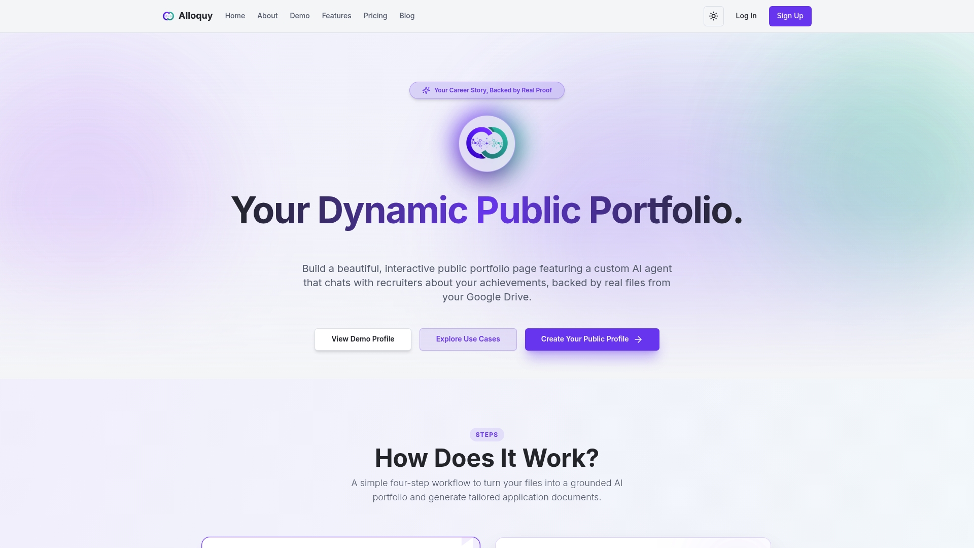
This isn’t a logo design service, it’s the layer that sits underneath your visual identity and proves the claims your logo represents. Once your kit is finished, apply consistent color and type choices to your profile theme and check the pricing and plan details for available options to showcase your evidence.
Sources
For deeper detail on execution, see the personal logo creation guide, personal brand visual identity guidance, and the personal website branding checklist for aligning your favicon, avatar, and domain.
- How to Create a Personal Brand Logo (Without a Designer) | IP
- Personal Brand Visual Identity: How to Build It Right (2026) | Evoke Studio
FAQ
How Can I Create a Personal Brand Logo?
Start with a wordmark in one distinctive typeface, pick one bold color plus a neutral, and build a small-space monogram version for avatars and favicons. Export an SVG master, PNG sizes, and a favicon, then write three usage rules before you use it anywhere.
What Is a Personal Logo?
A personal logo is a visual mark, usually a wordmark or monogram, that represents an individual’s professional identity rather than a company. For most people it’s simpler than a corporate logo: a name treatment, one color, and consistent typography.
What Are the 5 P’s of Personal Branding?
Definitions of personal branding components vary across sources, and no single version is universally standard. Rather than force-fit a framework, focus on what actually drives recognition for an individual: a consistent name treatment, one repeated color, and a clear typographic voice used everywhere.
What Is an Example of a Personal Brand?
A consultant using a clean serif wordmark with one accent color across their website, email signature, and LinkedIn header is a common personal brand example. A creator selling courses under a distinct symbol, separate from their own name, is another.
Do I Need a Designer to Make a Personal Logo?
No. A wordmark is achievable in Figma or Canva in an afternoon, and the consistency system matters more than paying for a custom mark. A freelancer or designer is worth it mainly if you need a symbol for merch or a productized brand.