

The best design case studies open with a single outcome statement that names your role, the metric or user gain, and one decision you made. Everything else, discovery notes, sketches, sitemaps, exists to support that opening claim. Three elements separate a case study that gets a callback from one that gets skimmed: a named decision the designer actually made, evidence attached to that decision, and an outcome stated in concrete terms. Below are copy-ready patterns, a template, and a publishing route that keeps the evidence attached to the story.
TL;DR:
- Presenting only 2 to 5 well-structured case studies, each focused on a single decision and backed by concrete evidence, is more effective than producing many shallow examples.
- Using decision-focused patterns like metric turnaround or constraint-driven fixes helps highlight key judgments and provides clear evidence, increasing case clarity.
- Visuals should be minimal, annotated, and directly support the decision, with static images favored over lengthy videos to keep reviewer attention on the evidence.
- Quantitative impact should be verified with clear measurement methods, baselines, and lifts, or supplemented by qualitative feedback when metrics are unavailable.
- Linking artifacts directly to claims within an interactive platform allows recruiters to verify decisions quickly and reduces reliance on detached or expired evidence.
Table of Contents
- Design Case Study Examples You Can Copy and Adapt
- Build Your Case Study From This Fill-In Template
- How to Use Visuals So They Support the Story
- How Do You Present Impact Without Overselling It?
- Where Should You Publish Your Case Studies?
- What Experienced Reviewers Notice First
- Publish a Case Study Recruiters Can Actually Query
- Sources
- FAQ
Design Case Study Examples You Can Copy and Adapt
Most designers stall on the blank page because they try to narrate the entire process instead of picking a pattern that fits the project. Five patterns cover almost every situation you will face, and each works because it leads with a decision rather than a task list.
- The metric turnaround. Use this when you have before/after numbers. Hero line: “Redesigned checkout flow as lead product designer, cutting drop-off from 34% to 19% in eight weeks.” The decision beat: you chose a single-page checkout over a multi-step wizard despite stakeholder pushback, and you show the A/B test screenshot as evidence.
- The zero-to-one build. Use this for greenfield products with no prior baseline. Hero line: “Designed the onboarding experience for a healthcare app from concept to launch, reaching 4.2 average App Store rating at 90 days.” Show the wireframe evolution, not the final polish alone.
- The system consolidation. Use this when you unified fragmented patterns into a design system. Hero line: “Led the design system audit that reduced component variants from 47 to 12 across three product teams.” The visual to show is a before/after component grid, not a style guide cover page.
- The constraint-driven fix. Use this when the interesting part was working around a limitation, not a blank canvas. Hero line: “Redesigned a legacy dashboard within a frozen backend, improving task completion by 22% without a single new API call.” Show the constraint diagram alongside the final UI.
- The research pivot. Use this when user testing changed your direction mid-project. Hero line: “User interviews revealed the wrong problem; repositioned the feature from a scheduling tool to a reminder system, raising week-two retention.” Show the pivot moment as a two-panel comparison, original hypothesis versus revised one.
Each pattern earns its place because it names a decision in the first line rather than describing a phase of work.
Build Your Case Study From This Fill-In Template
A reliable skeleton runs hero, context, three decision beats, results, and learnings. That structure comes from templates that recommend 800 to 1,500 well-structured words, which is short enough to read in one sitting and long enough to show real judgment.
- Hero (one sentence): What changed, your role, and the timeline. “As lead designer over six weeks, I redesigned the referral flow, increasing conversions by 15%.”
- Context (two to three lines): Team size, constraints, and scope. Name what you did not control, a fixed deadline, a legacy codebase, a two-person team, since constraints make decisions more defensible.
- Decision beats (one per contested choice): Follow a situation → options → choice → trade-off → evidence format. Example: “Users abandoned the form at step three. We considered auto-save versus a progress bar. We chose auto-save because interviews showed anxiety about losing data, even though it added backend complexity. Session recordings after launch showed a 40% drop in mid-form exits.”
- Results block: State your measurement method, the baseline, and the lift, in that order. If you lack numbers, replace the lift with a qualitative signal and note the sample size.
- Learnings: One paragraph on what you would do differently, not a generic reflection.
Keep visuals balanced against text. A hero image, one annotated screen per decision beat, and a single results chart is usually enough; more than that starts competing with your own writing for attention.
How to Use Visuals So They Support the Story
Default to one strong visual per section. A single well-annotated screen does more work than five loosely captioned screenshots, because pairing each chapter with one effective visual keeps a reviewer’s attention on the decision, not the artifact count.
Reserve short prototype clips (10 to 20 seconds) for interactions that a static image cannot explain, a gesture, an animation, a multi-step flow. Anything longer turns into a video the reviewer will skip.
For before/after comparisons, annotate directly on the image: circle the friction point, label the fix, and keep captions under one line. A side-by-side layout reads faster than a slider that requires interaction to compare.
Headlines carry more weight than most designers assume. A heading should convey most of the point on its own, since scanning readers often absorb the story from headings alone before reading body text.
- Compress screenshots for fast load times without visible artifacting.
- Add alt text describing the decision shown, not just the image contents.
- Use consistent frame sizes so the eye does not re-adjust between sections.
Pro Tip: Take your final screenshot pass and delete every image that does not visually answer “what changed here.” If you cannot state what the image proves in one sentence, cut it.
How Do You Present Impact Without Overselling It?
State your measurement method before the number, then give the baseline, then the lift. That order lets a skeptical reader verify your claim instead of just trusting it.
When you lack hard metrics, qualitative evidence still counts if you contextualize it:
- State the sample size and purpose of any usability test, even a five-person round.
- Quote a stakeholder or user directly rather than summarizing sentiment.
- For early-stage or unlaunched work, state the plan for measuring impact post-launch instead of inventing a number.
Guides on structuring UX case studies recommend reporting method, then baseline, then lift, marked clearly as relative or absolute, since vague percentages without a baseline read as inflated. Tools like the KPI tracking guidance from Baby Love Growth offer a useful framework for choosing which metrics actually reflect user behavior versus vanity numbers.
Where Should You Publish Your Case Studies?
A static personal site gives full design control but nothing to point recruiters toward beyond what they choose to read. Site builders speed up publishing but often bury decision beats inside generic templates built for visual portfolios, not evidence. Dedicated portfolio platforms sit in between: faster than custom code, more structured than a website builder, but still passive, the recruiter reads what you wrote and takes your word for it.
Interactive evidence matters most in two moments: when a recruiter is screening quickly and wants to verify a claim without a call, and when you are prepping for an interview and need every artifact linked to its decision. Certain interactive portfolios attach verified source documents to specific claims and add a query interface, turning a static story into something a recruiter can interrogate directly.
This platform fits this second category. It links actual Google Drive documents to achievements in your case study, so a recruiter’s AI query about your checkout redesign can return evidence files, not just descriptions. Consider it when:
- You want recruiters to verify claims without scheduling a call first.
- You are prepping for interviews and want every decision traceable to its evidence.
- You need one profile that generates tailored resumes from the same verified data.
A portfolio case study template built for this format is available to test against a free profile.
What Experienced Reviewers Notice First
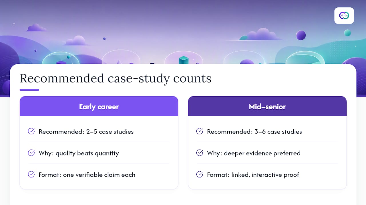
Reviewers do not reward volume. A handful of well-built case studies, two to five for early-career designers and three to six for mid-senior ones, beats a long list of shallow write-ups every time, because quality of decision-making reads faster than quantity of projects.
The most common mistake is narrating the whole process instead of naming the one decision that mattered. A close second is presenting evidence that lives somewhere else, a Figma link that has since expired, a deck the recruiter never opens. Evidence detached from its claim is functionally no evidence at all.
This guide is built around a simple bet: hiring cycles shorten when a recruiter can verify a claim in seconds instead of waiting for a follow-up email. The interactive case study format exists because static PDFs cannot answer a follow-up question, but a linked document can.
— Alloquy Team
Publish a Case Study Recruiters Can Actually Query
This solution turns your case study artifacts, like A/B test files, usability reports, or design system audits, into evidence that a recruiter’s AI assistant can query directly, instead of static claims only.
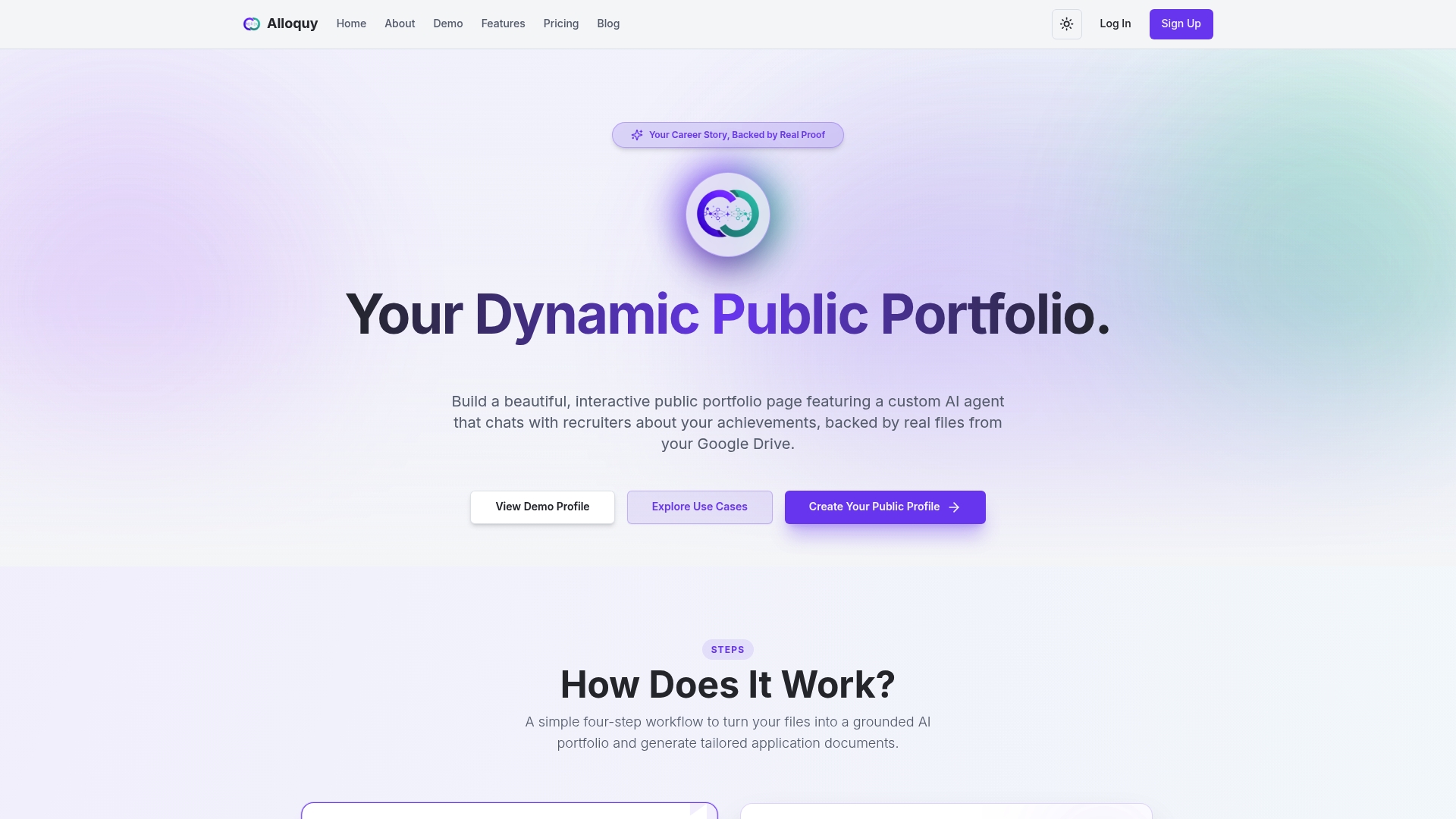
Start with a free profile: link your Google Drive documents, drop in the template structure from this guide, and you will have one queryable case study live within an hour. The free tier covers the essentials; if you want expanded evidence storage and generation limits for tailored resumes and cover letters, pricing details are on the site. Either way, the next step is the same: create your profile and attach one real decision to one real piece of evidence.
Sources
- How to Write a Strong Case Study for Your Portfolio in 2026
- The Ultimate UX Case Study Template & Structure (2026 Guide)
- Writing a UX Design case study that shows thinking, not just pixels
FAQ
What Is a Design Case Study?
A design case study is a written and visual account of one project that shows the problem you faced, the decisions you made, and the outcome that resulted. It differs from a resume bullet because it shows judgment in context, not just a claimed result.
How Do You Make a Design Case Study?
Start with a decision log, situation, options, choice, trade-off, and result, for every contested choice you made on the project. Then build the case study around hero, context, decision beats, results, and learnings, keeping the total around 800 to 1,500 words.
Can ChatGPT Write a Case Study?
ChatGPT can help draft structure and tighten sentences, but it cannot supply the actual decisions, trade-offs, or evidence that make a case study credible. The strongest case studies come from a real decision log paired with real artifacts, something a tool like Alloquy helps surface by linking your actual documents to your claims.
What Is the Best Design Case Study Format?
The strongest format leads with a hero statement naming your role and outcome, then breaks the project into three or so decision beats with evidence attached to each. Format matters less than whether a reviewer can verify your claims, which is why linking real evidence, not just describing it, tends to outperform purely narrative write-ups.